My role in this project
- UX research
- UX design
- Prototyping
- UI design
- Brand design
Problem
How could I increase awareness of M3E's comprehensive EV services to prevent market fragmentation, establish market leadership, and improve data management across customer touchpoints?
How could I increase awareness of M3E's comprehensive EV services to prevent market fragmentation, establish market leadership, and improve data management across customer touchpoints?
Outcomes
- 15% increase in conversion rate, and thus in sales
- A new B2B business funnel
- An App that allows EV market actors increase their profit through M3E's service
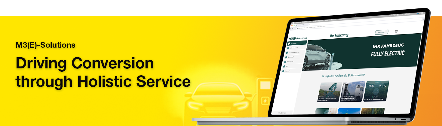
The Brief
M3E GmbH, a Berlin-based electric mobility startup, wanted to establish itself as a market leader by offering the broadest range of electric vehicle (EV) services to vehicle salespeople and end customers. However, customer feedback revealed that users were unaware of M3E’s full service portfolio and relied on multiple fragmented providers, diluting the market.

The Goal
Create a user-friendly 0-to-1 web application to showcase M3E’s comprehensive services, increase sales conversions, and improve data management efficiency.
Challenges & Constraints
- User Awareness: Customers didn’t know about M3E’s full service offering or the economic benefits of EV investment.
- Data Clutter: Multiple customer touchpoints (phone, email, third parties) caused fragmented and error-prone data management.
- Time Pressure: The design timeline was short (2 weeks), and I was the only designer involved.
- Limited User Research: No direct user testing was possible; insights came from stakeholder interviews and desk research.
- Development Efficiency: Needed to accelerate design handoff and development using existing component libraries.
Research & Decision-Making
- Conducted stakeholder interviews and desk research to understand market benchmarks and competitor approaches.
- Hypothesized that a desktop web app would educate EV buyers on M3E’s holistic offering, helping them maximize benefits and increasing customer retention.
- Prioritized an MVP focused on core features to measure impact quickly, balancing scope with time constraints.
- Used Tailwind UI’s Ant Design components and M3E’s existing design assets to speed up prototyping and maintain consistency.
- Chose the Lato typeface for its legibility, modern look, and ease of implementation, aligning with M3E’s corporate identity.
Interface Framework and Visual Components
Following Jakob Nielsen’s Ten Usability Heuristics about Consistency and Standards, I used Tailwind UI's Ant Design open-source kit for intuitive navigation, responsiveness, and easier delivery to the Development team. It also helped to quickly develop high-fidelity mockups, helping Sales pitch to prospective clients by providing a visual example.
I also chose Lato typeface because of its high legibility in different styles, its modern aesthetic that matches M3E's brand identity, and its ease of implementation as a Google font for the development team, streamlining the development process.
For the layout, I defined a 12-column grid, where half of the space is used to present information and one-third for navigation for effective information presentation. I made this decision based on the electric mobility benchmarks and parallel industry players identified while researching.
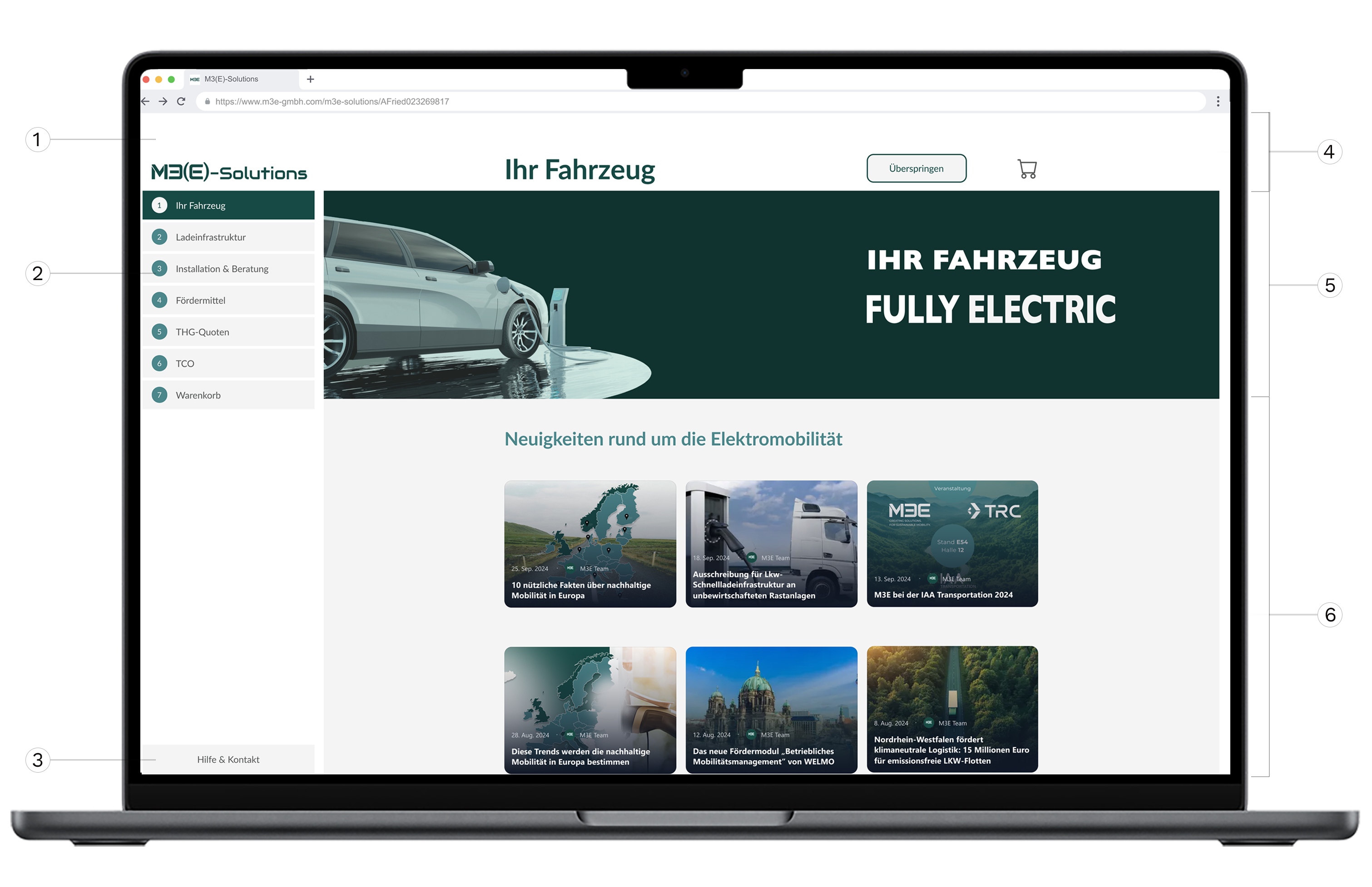
1. Branding & color scheme
I applied M3E's brand color ensuring color contrast and usability compliance with EAA. I also adapted the company logo to create M3(E)-Solutions logo, keeping it minimal and recognizable, based on Jakob Nielsen's heuristics.
2. Navigation & easy editing
Implemented a sidebar stepper with numbered steps and clear titles for progress tracking and easy navigation back to previous points, following Jakob’s Visibility of System Status Usability Heuristic.
3.Help & Contact button
I included a separate, icon-less help button in the sidebar enabling quick access to M3E expert assistance for salespeople, providing crucial customer support. I decided to separate the button to prevent misclicks and navigation errors.
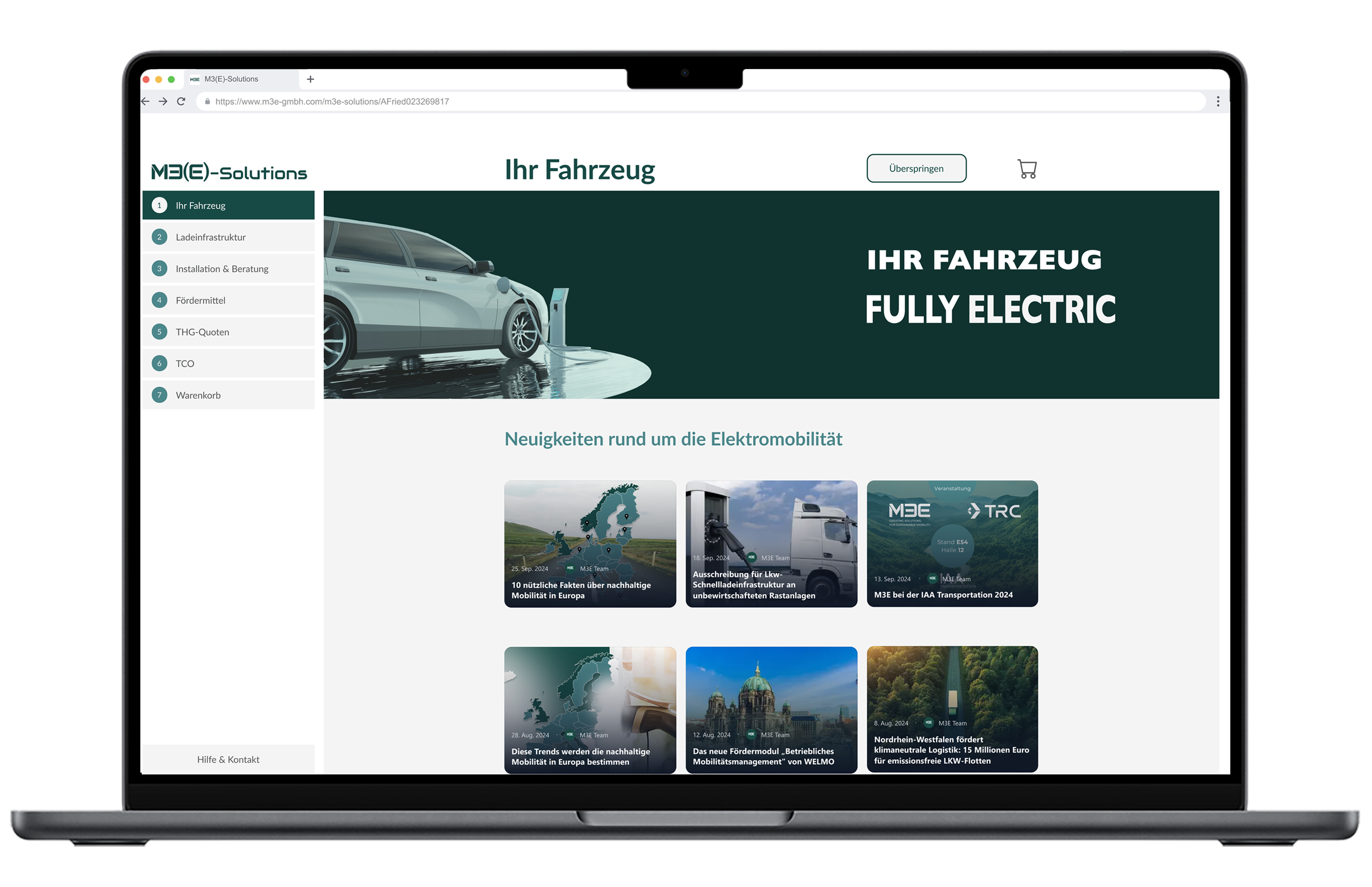
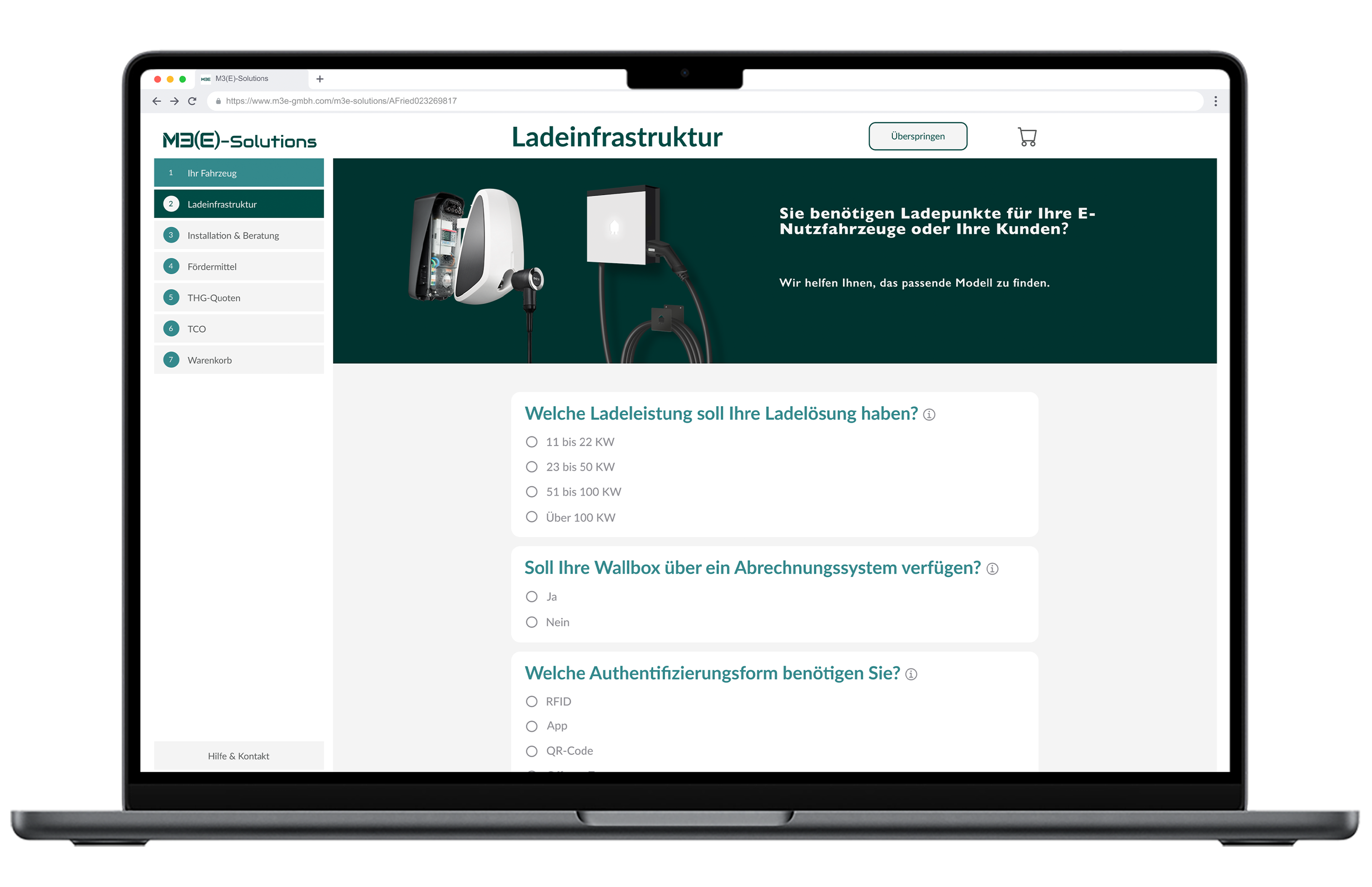
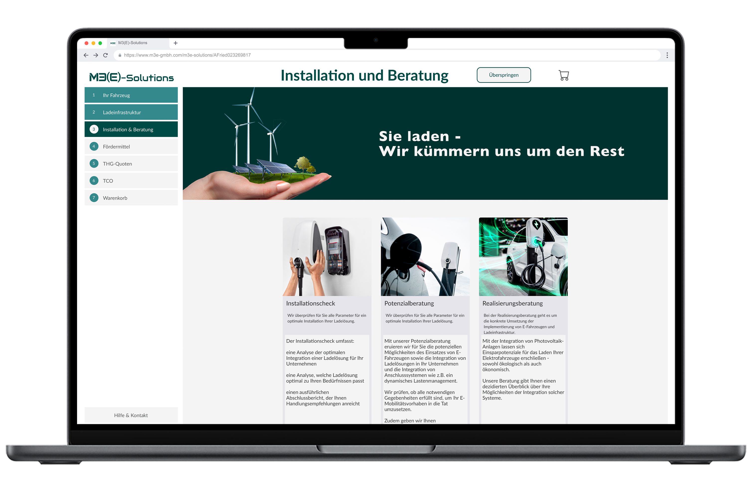
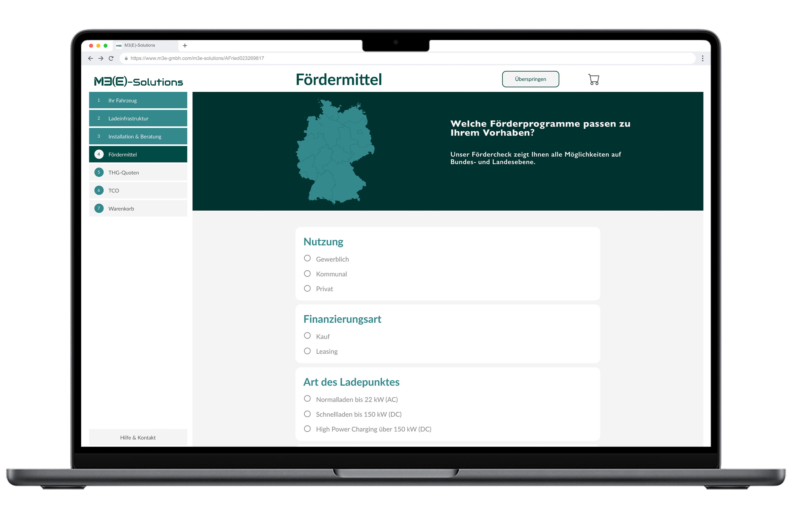
4. Top row
It shows the step/section title and Shopping cart button for selected products. This keeps users informed, helping them quickly identify their location in the process and what follows next.
5. Central row
An image banner serves as a marketing intro and promo hook. It also prefaces upcoming information and gives the marketing team control over banner content, allowing updates based on user needs and market changes.
6. Bottom row
It shows the main content and allows to input the data requiredto customize the best customer offers. Displays plenty of information above the fold, encouraging users to scroll for more, ensuring a smooth navigation.
Design & User Flow Highlights
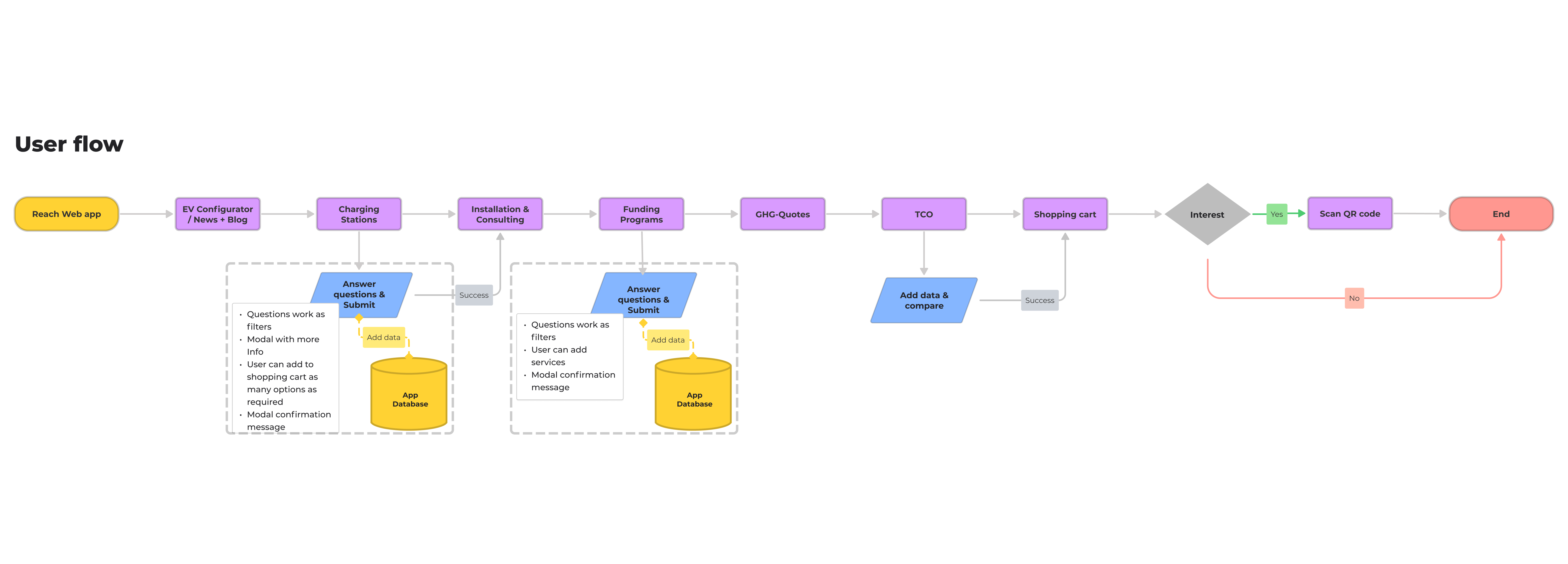
1.
News + Blog
Relevant information and special features, such as news about funding or innovations, are presented to users.
Relevant information and special features, such as news about funding or innovations, are presented to users.
2. Charging Stations
Help users identify suitable charging solutions. Users can then request M3E an offer for the more appropriate option.
Help users identify suitable charging solutions. Users can then request M3E an offer for the more appropriate option.
3. Installation and Consulting
It offers users booking options for installation services. E-consulting packages covering the entire M3E offering.
It offers users booking options for installation services. E-consulting packages covering the entire M3E offering.
4. Funding programs
Quickly access applicable funding. Users can quickly learn about each program and use M3E to help optimize them.
Quickly access applicable funding. Users can quickly learn about each program and use M3E to help optimize them.
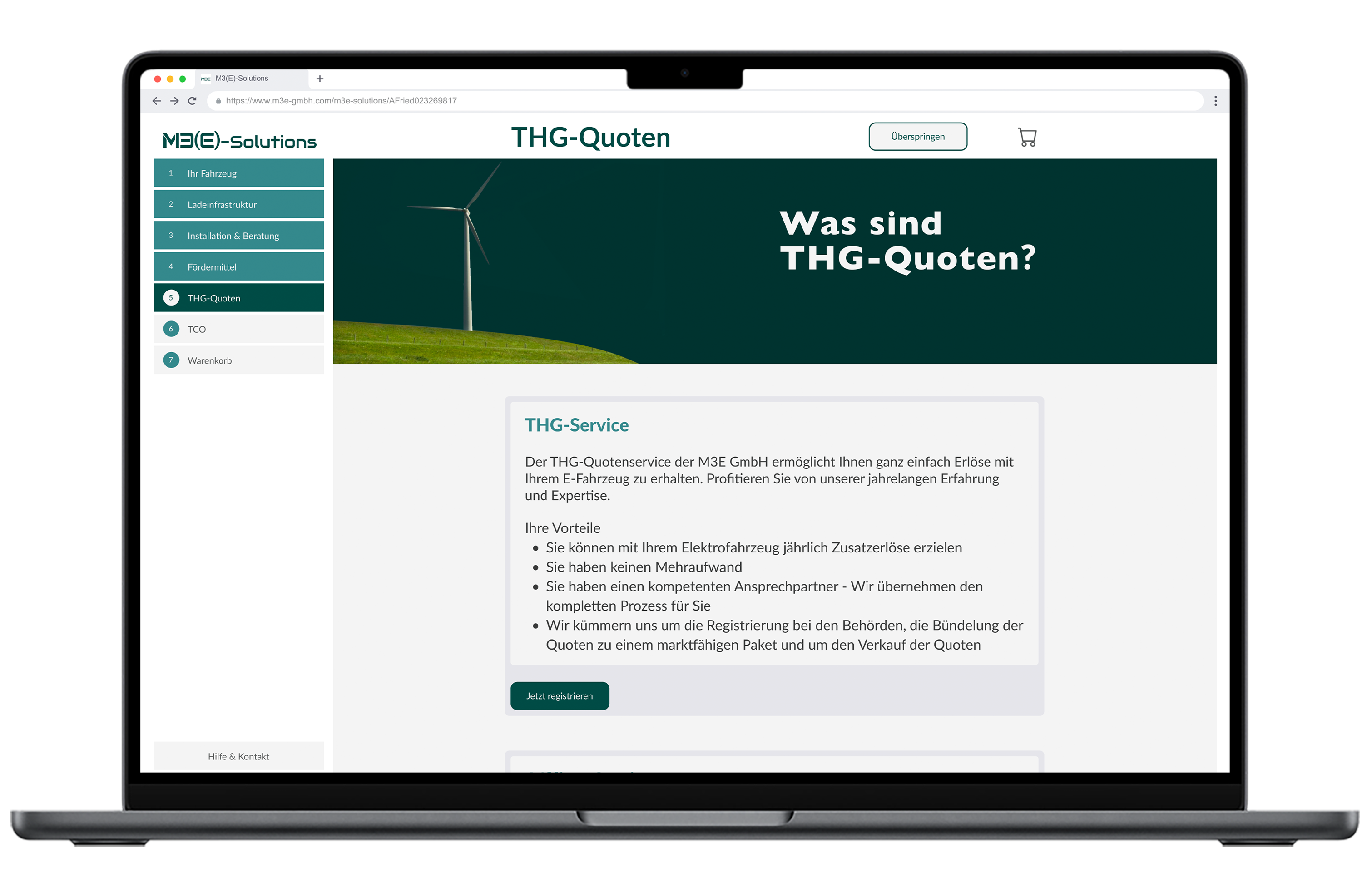
5. GHG Quotes
Clearly explain environmental policies. M3E's GHG Quotes consultation service can be booked here with one click.
Clearly explain environmental policies. M3E's GHG Quotes consultation service can be booked here with one click.
6. TCO calculator
Highlight the long-term cost benefits of EVs versus combustion vehicles, summarizing costs over 10 years.
Highlight the long-term cost benefits of EVs versus combustion vehicles, summarizing costs over 10 years.

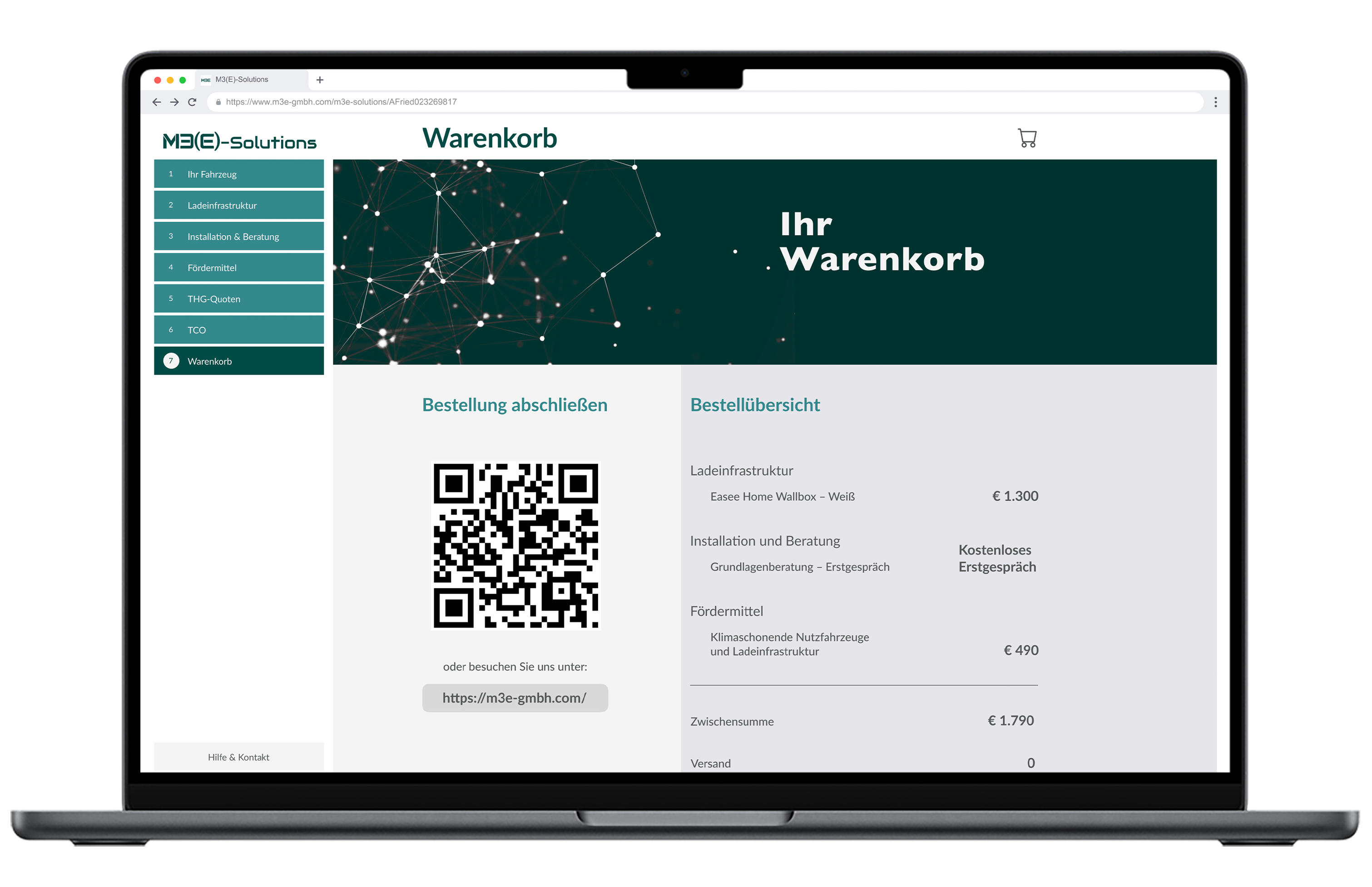
7. Overview
A QR code is generated linking to a tailored website with all relevant information for the users summarized.![]()
A QR code is generated linking to a tailored website with all relevant information for the users summarized.
Iterations & Testing
Conducted rapid in-person usability tests with colleagues unfamiliar with the product to simulate first-time user experience.
Before usability testing
![First version of the mock-up before usability testing.]()

Based on
usability
testing, we removed unnecessary features such as the language selector (language auto-detected by IP) and floating wizard button (annoyed 70% of testers).
Simplified navigation by replacing the Settings button with a Help/Contact button.
Simplified navigation by replacing the Settings button with a Help/Contact button.
After usability testing
![Mock-up version with changes made based on usability testing results.]()
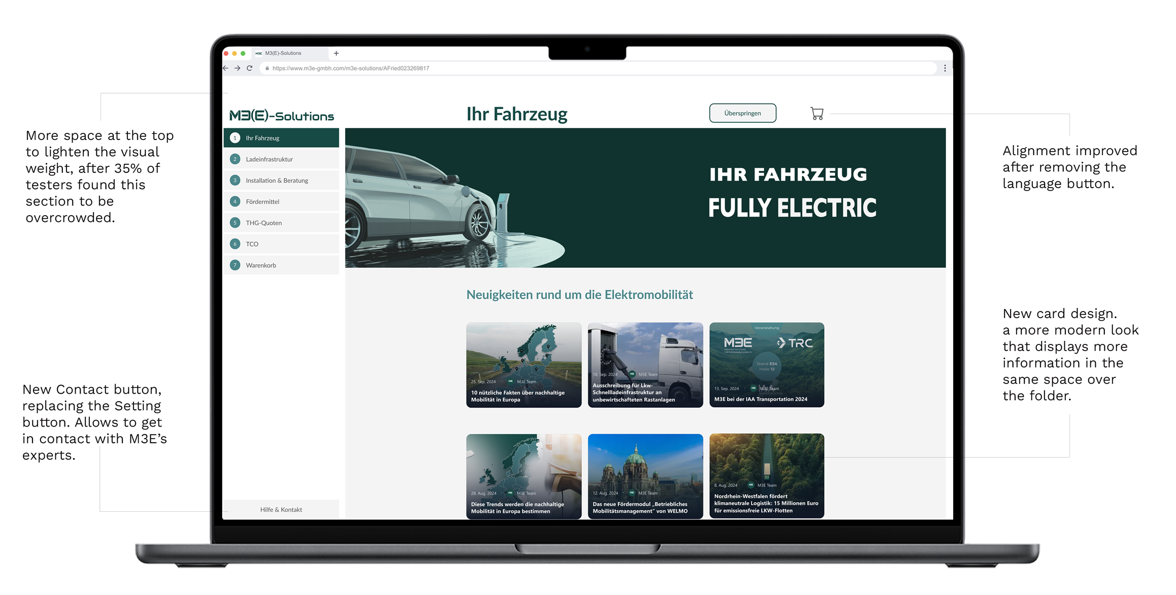
Another change was adding more top padding for clearer space, as 35% of testers found it crowded and hard to read.
Adjusted information card padding and layout based on feedback to improve readability and display more content above the fold.
After implementing the changes, a second prototype version was presented to stakeholders, as seen in the following video.
Since the design satisfied company MVP expectations, stakeholders moved the mock-up to IT development, which took about 6 months. During this period, I collaborated with IT making minor adjustments and corrections. Management decided to collect user feedback and both qualitative and quantitative data from actual users after launching the live version.
Impact & Results
- Delivered a flexible white-label web app integrating all M3E services into a single platform.
- Streamlined data processing, reducing clutter and improving efficiency in customer information management.
- Enabled salespeople to better showcase M3E’s value proposition, leading to a 15% increase in conversion rate.
- Created a new B2B business funnel, expanding M3E’s market reach and revenue streams.
- Received positive feedback from our clients salespeople and our stakeholders, validating the product’s market fit and usability.
By aligning UX and business objectives, we positioned M3E as an end-to-end solution provider in the EV market. This project exemplified how thoughtful design can lead to tangible business outcomes, ultimately supporting M3E’s mission to empower customers in their electric vehicle journeys.
15%
increase in conversion rate

New
A new B2B business funnel

More
Customers profits’ boost with M3E's servicesWhy This Product Is an Improvement for M3E GmbH
- Market Differentiation: Consolidates fragmented EV services into one comprehensive platform, reducing market dilution.
- Customer Empowerment: Educates users on the full benefits of EV ownership and M3E’s offerings, enabling their customers to take informed decisions.
- Operational Efficiency: Integrates multiple customer touchpoints into a streamlined data flow, reducing errors and manual overhead.
- Business Growth: Directly supports sales teams with up-to-date market info and tools, increasing conversion and retention.
- Scalable & Flexible: White-label design allows customization for different EV dealers, supporting future growth and partnerships.
Learnings
- Rapid product development in a startup requires balancing speed with quality and user insights.
- Desk research and stakeholder interviews can effectively guide design when direct user research is limited.
- Iterative prototyping and internal testing are essential to refine usability under tight deadlines.
- Collaboration with development teams and stakeholders ensures smooth handoff and alignment on goals.
- Post-launch user data collection is critical to validate assumptions and guide future improvements.
While I am satisfied with the results, I would prefer to have more testing resources (time, testers and iterations) to avoid designing with so many uncertainties and assumptions. But I understand that this is how these initiatives work in a bootstrapped start-up environment.
Special Shoutouts
Dennis Schneider, Key Account Manager
Daniel Yanev, Teamlead Funding - Consultant
Marco Acuña, Project Manager
Wiebke Wilsky, Social Media Manager
Yunus Szönyi, Fullstack Developer
Neriman Avrupali, Front-End Developer
Daniel Yanev, Teamlead Funding - Consultant
Marco Acuña, Project Manager
Wiebke Wilsky, Social Media Manager
Yunus Szönyi, Fullstack Developer
Neriman Avrupali, Front-End Developer
Review the complete UX/UI design Case Study
Read on Medium ︎
Read on Medium ︎
Next Case Study:Building community beyond scores.→
When community interaction drives subscriptions.
When community interaction drives subscriptions.
Interested in creating value for your business or project?
