My role in this project
- UX research
- UX design
- Prototyping
- UI design
Problem
The goal and main KPI was to increase the conversion of new customers from the free trial to a paid subscription.
The goal and main KPI was to increase the conversion of new customers from the free trial to a paid subscription.
Outcomes
- A new feature to make users be and feel part of a community
- A social feature to increase the number of paid subscriptions.
Client
BEAT81
It’s a fitness start-up company founded in 2017 that offers several workout options, overseen by professional trainers, as they use heart rate technology to track the user’s progress, ensuring optimal performance.
BEAT81
It’s a fitness start-up company founded in 2017 that offers several workout options, overseen by professional trainers, as they use heart rate technology to track the user’s progress, ensuring optimal performance.
Additional Information
Team
Karolina Do Huu, Anubha Singh, and myself.
Platform
iOS / Android
Timeline
9 days.
Team
Karolina Do Huu, Anubha Singh, and myself.
Platform
iOS / Android
Timeline
9 days.

Why do we do this?
Problem definition
Many new users take up the three free trial training sessions offered by BEAT81, but do not continue on to the paid upgrade.
1
Social componentUser surveys and interviews conducted by BEAT81, and corroborated by our independent research, confirm that
enhancing social connections and a sense of community can prolong their clients' attendance and performance.
2
Word of mouthThe mutual motivation while doing group exercise has proven to be important for users, increasing word of mouth, which attracts new users.
3
Limited instances of socializationUsers who attend alone quickly leave the venue once the workout is over, reducing potential instances of socializing with other attendees.
Current experience
Business analysis
Business analysis
Regularly attending workouts is an emotional experience that requires motivation and determination. High-impact workouts are not easy for first-timers and BEAT81 knows it.
1
Target audienceThe target audience of BEAT81 is 25 to 40 years old, with a female majority (65/35). The users practice sport actively but not professionally, and they have a medium to medium-high finance level.
2
“Energize others”This is one of BEAT81’s values, because they know that a positive community is unstoppable, so they do everything they can to nurture and energize it. This reinforces the need to develop a community.
3
CommunicationThe app is used by both BEAT81 users and coaches, as the former can book their workouts, track their results and chat with the latter through the application.
What else is out there?
Competitor analysis
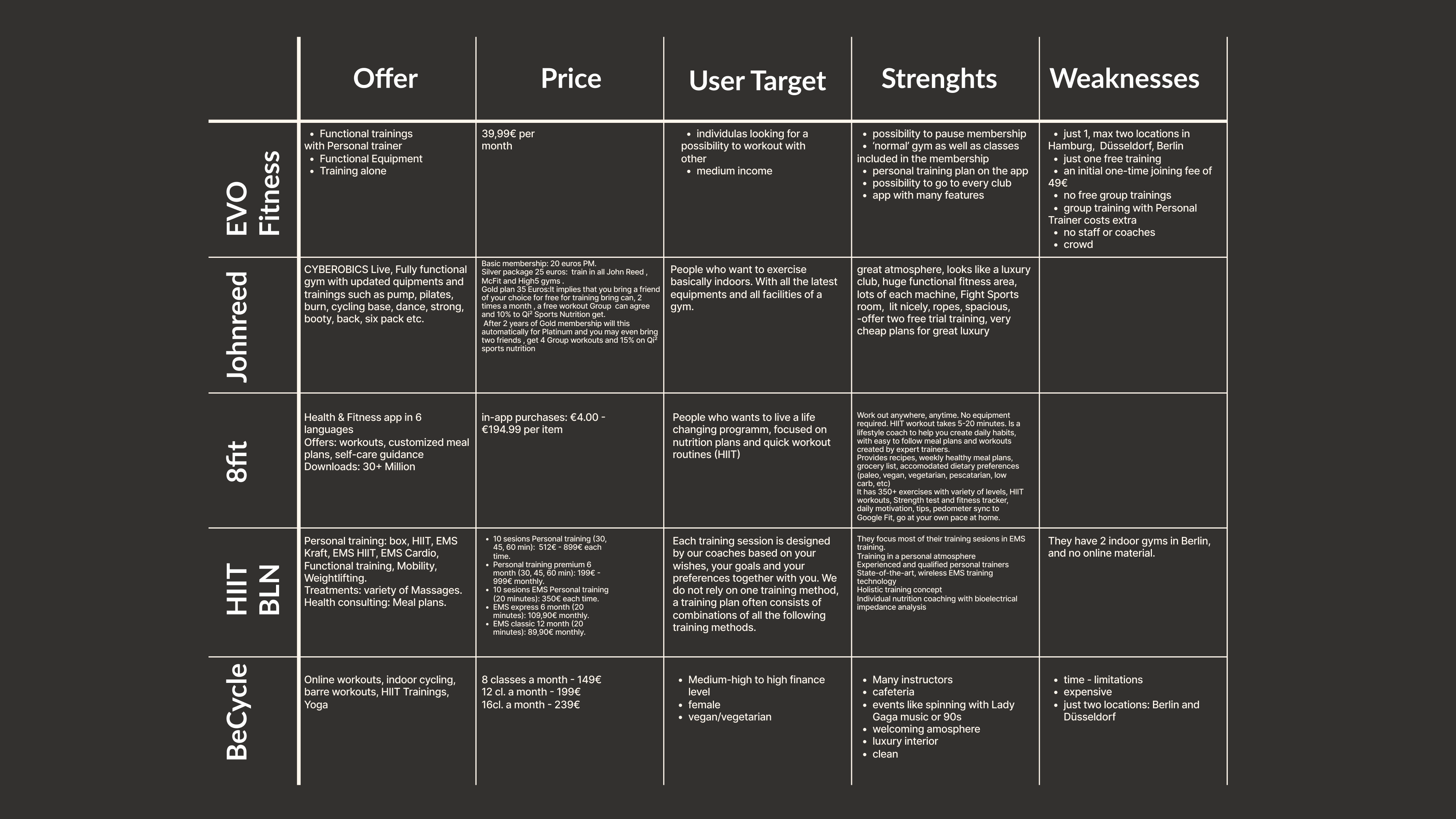
Spinning clubs, boutique gyms and offline gyms are considered by the stakeholders as their main competitors, so we analysed five of the companies named by them, according to their offer, prices, target user, their strengths, weaknesses, and customer service.
1
Most competitors don’t offer group workouts, focusing on individual personalised workouts.
2
Some of them focus on luxury interiors as part of their main offer.3
Most competitors have big problems with customer service.
4
Their locations are limited by their expansion level, in contrast to BEAT81, which works in partnership with other gyms.5
In most cases, they only offer one workout session as a trial.6
Some offer nutritional assistance in addition to more mainstream services.7
Only a few offer special workout events.
8
Some of them provide employee discounts, as part of their B2B strategy.
Nice to meet you
User Persona
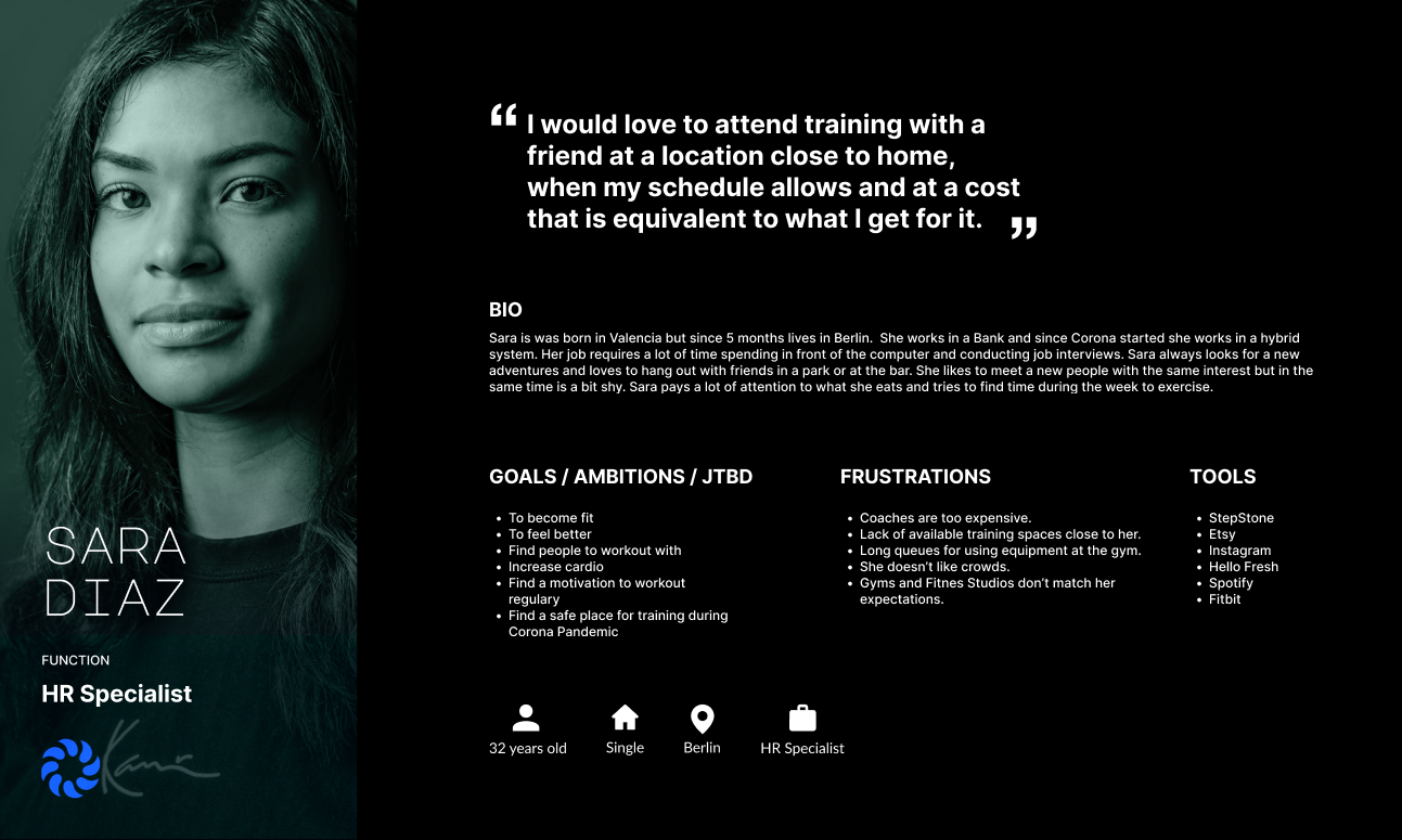
Based on the learnings gathered during the UX research, we created a User Persona called Sara to help us keep in mind her motivations and needs, and how these translate to online use and consumption, and ultimately to purchasing decisions
Hypothesis
We believe, that by creating a social feature in the app our users are going to feel more like a part of the community which will motivate them keep attending to the classes. This feature will help to increase the number of paid subscriptions.
We will know we are right by comparing the volume of new users generated after the implementation of this new feature with the current numbers of users,
and the qualitative feedback.
Getting creative
Ideation
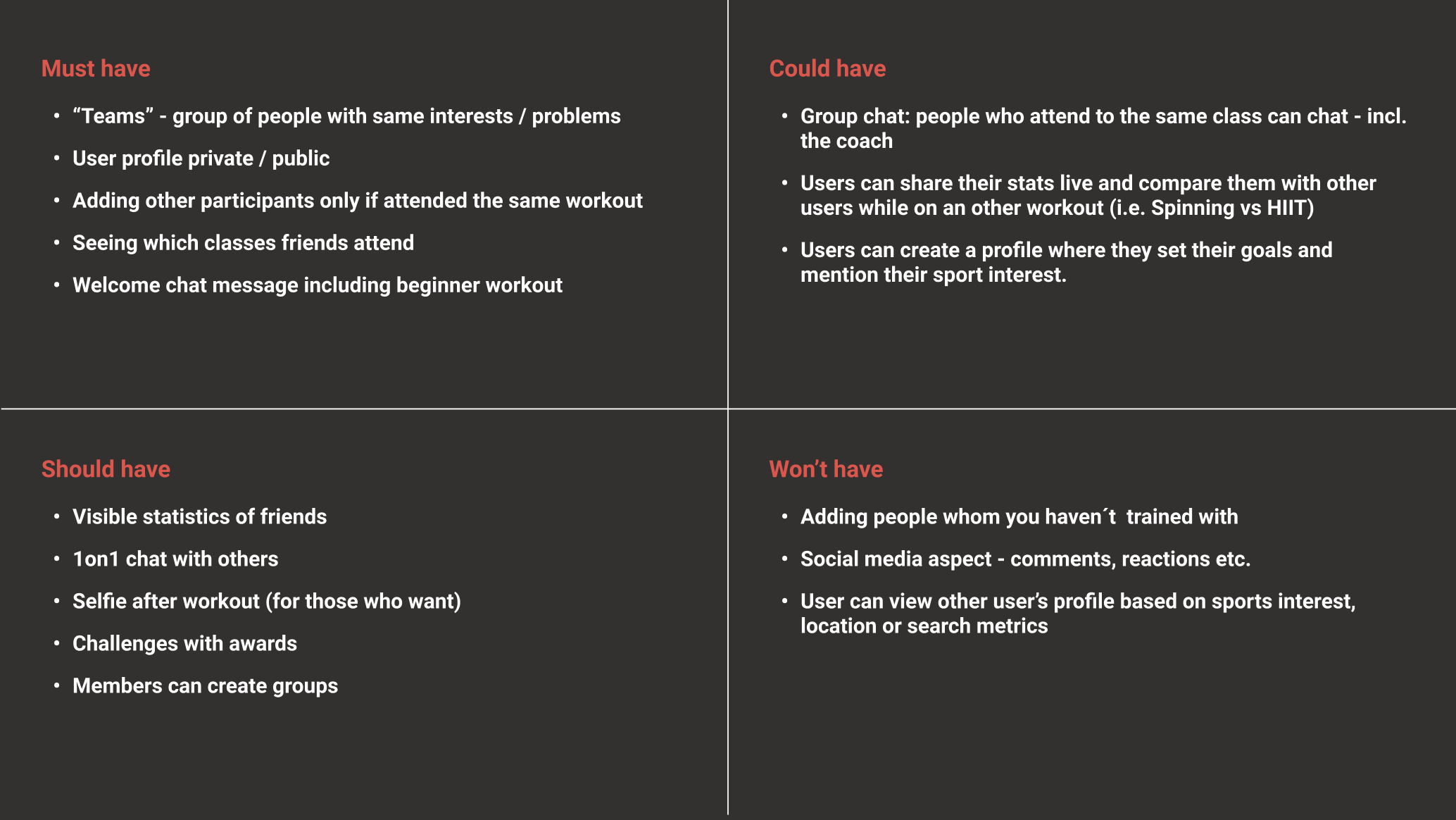
As we began the ideation stage, we decided to use the crazy 8 method to come up with as many ideas as we could. We then prioritized them using the MoSCoW method to come up with the best possible solutions, suitable to fulfill the Hypothesis.
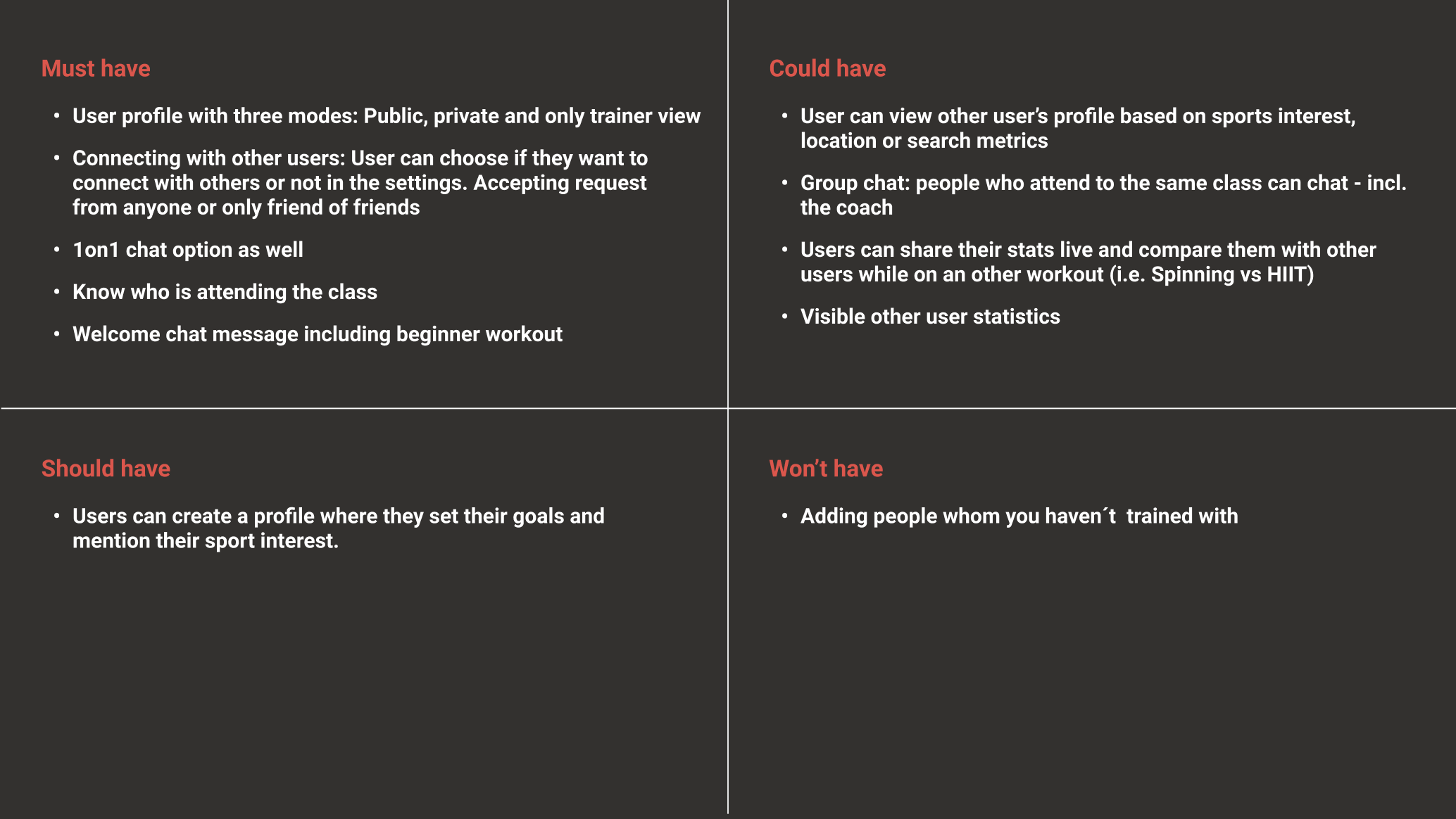
Based on this, we decided that the new feature must have the following in considerations:
Additionally, as a Value proposition, M3E offers all services as a complete package from a reliable and proven expert, with personalized assistance from a group of experts.
1
Profile modes
The different levels of privacy allow the users to keep their privacy for those who prefer to not share their information with strangers.
The different levels of privacy allow the users to keep their privacy for those who prefer to not share their information with strangers.
2
Optional socialization
There would be also an optional feature that allows connecting with others.
There would be also an optional feature that allows connecting with others.
3
1on1 chatThe current chat on the app is used to communicating only with the coaches. We want to allow users to communicate with other members in a 1on1 chat.
4
Attendees listAnother feature that we thought the app must have is allowing users to see who is attending the classes, enabling them to look for friends or acquaintances.
5
Easy startWe would extend the welcome message to enable to directly book a beginners’ workout. According to our stakeholders, those who start using the app attending these sessions have a longer customer life.
How should it work
User flow
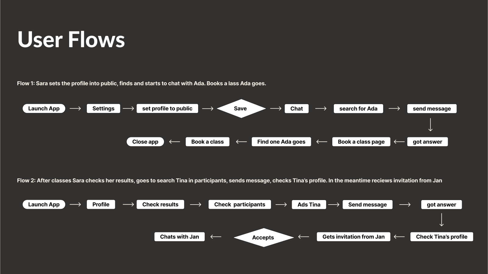
We set two different flows to attend workouts and add new connections.
1
Adding familiar faces.In the first one, Sara sets her profile as public and uses the search option to find a person she trained with last time — Ada. After adding the new contact to her list, Sara searches for the next workout Ada attends and books the same session.
2
Adding new peepsIn the second flow, after Sara finished the workout, she wants to add another connection that she just meet — Tina. This time she uses the “workout details” page to find and connect to her. While checking Tina’s profile, Sara receives an invitation from Jan who she met at the last workout, so she accepts and starts a chat.
UI design
Prototyping
To test the User flows, we took pen and paper and began to develop our Lo-Fi prototypes. After that, we selected what we evaluate as the best ideas and started to transfer this to our Mid-Fi prototypes.

After preparing our Mid-Fi prototypes, we uploaded them to maze.co to test user flows. Here we obtained 21 responses, of which we highlight the following:
1
Rearrangement
The privacy of the profile should be located in the Profile menu, not as we assumed as a part of a “Privacy” menu.
2
Improve attendees visualizationVisibility of who attends the class needs to be improved and better displayed to make it more intuitive to find.
3
Improve communication with testersIt’s important to write the tasks clearly, and inform testers that sometimes Maze needs a few seconds to react.
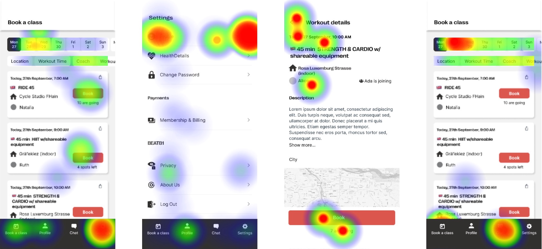
As seen in the heat maps above, we still needed to work a lot on solving many of the problems that our users keep having. Although some results received allowed us to continue working on improving our MVP, we felt that these would not meet the expectations of BEAT81 users and would not necessarily meet our KPI.
Building a community requires more than just a chat. That’s why we decided to go back to the ideation stage once more, to see if we can make some changes that allow us to reach our goals.
Getting more creative
Ideation V2.0
As we had a deadline to meet, we held a brainstorming session in which we reviewed our data and came up with new ideas and questions. As a result, our project took a new direction.
1
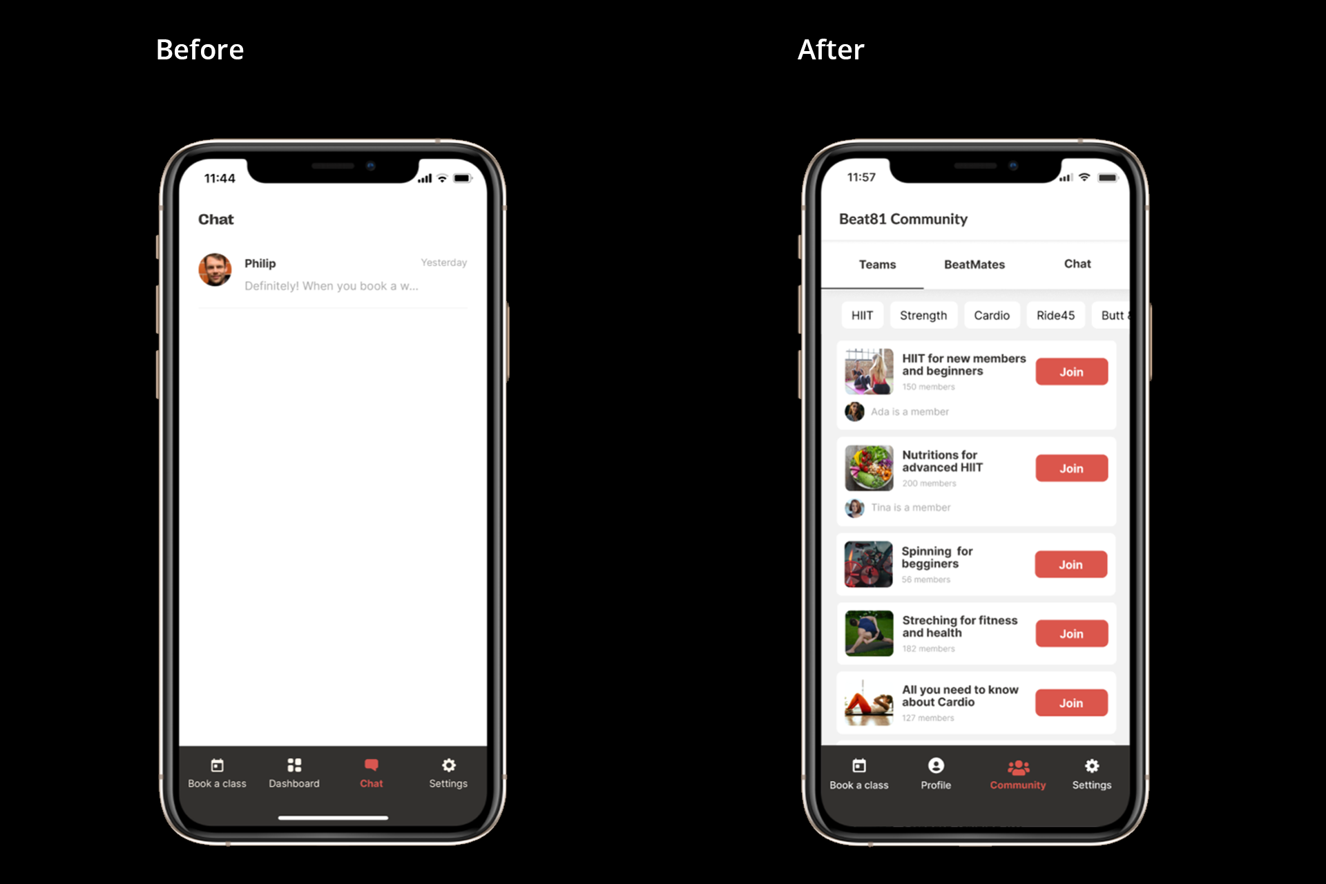
CommunityAs already mentioned, a chat alone doesn’t create a community, so we decided to keep it, but inside the new section called “Community” in which, in addition to the chat, we include a list of contacts, and a new feature called “Teams”.
2
TeamsIn “Teams” Sara can log on to any group in which they have an interest, depending on the workout format or any other topics related to BEAT81. Initially, only BEAT81 hosts could create new Team. This can be review in later to assess the benefits of users creating their own Teams.
3
BeatMatesTo foster a positive environment and prevent negative interactions, Sara can only add new contacts after attending the same workout. These contacts, called "BeatMates," enable users to view each other's statistics, results, and bookings, promoting friendly competition and camaraderie.
4
Among acquaintancesThe chat will be an option only available between BeatMates, allowing better filtering for Sara, while maintaining a safe and comfortable space for her.
5
Group selfieWe finally came with the idea of taking a group selfie after the workout, for those who want to participate in it, to reinforce again the team spirit and community. This picture would be visible only for those who take part in it.
Prioritizing new ideas
MoSCoW V2.0
After adding these new ideas to our MoSCoW method, it started to seem more like an experience that could motivate the building of a community.
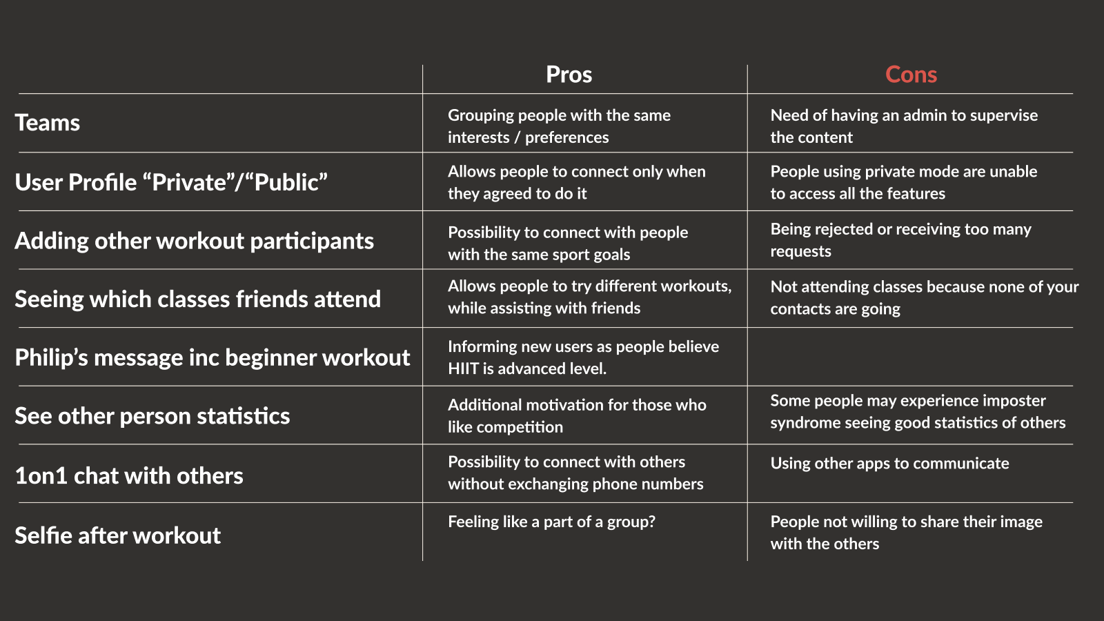
To be sure this time that the effects of our ideas will encourage the building of a community, we carried out a pros and cons analysis of them.
Where is each item located?
Sitemap
After that, we decided to define the sitemap, to see how our features will fit into the current state of the app, based on the information gathered during the first test. The cards in red show where our new features are added to the existing ones.

How should it now work
User flow V2.0
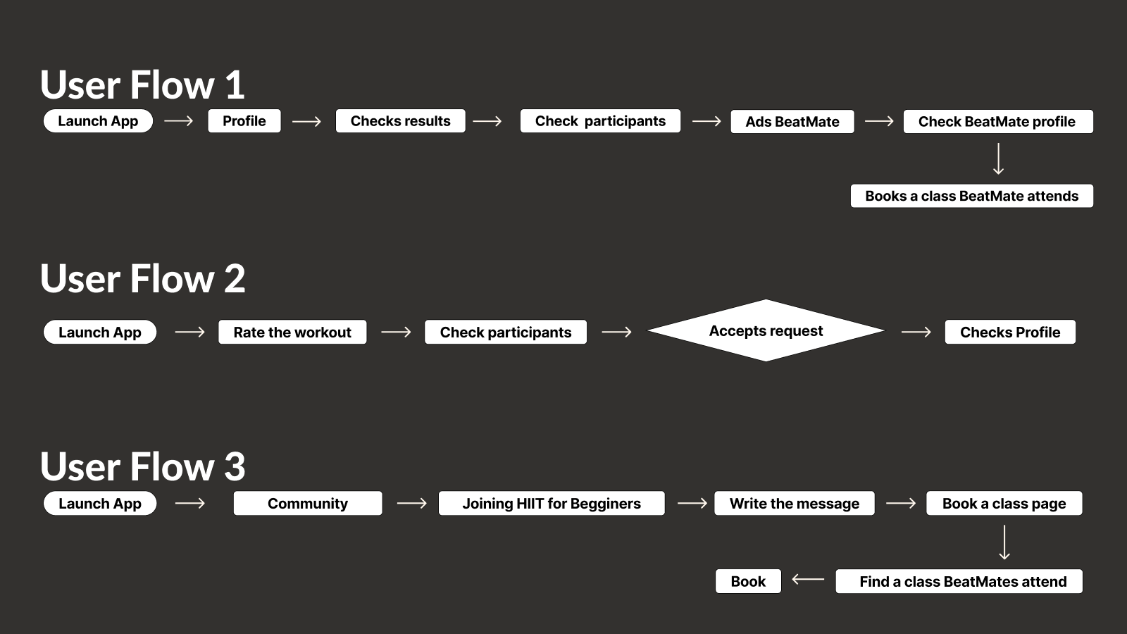
We designed three happy flows in which Sara can discover the new functionalities of the app. These flows helped us to test later how the new features will affect the experience.
1
Flow 1Sara launches the app and checks her stats from the last workout, so she opens her profile, and then check her results. Afterwards, she checks the attendance list and finds Tina, to whom she sends a connection request. After Tina accepts the request, Sara checks Tina’s profile and books a slot at the next training Tina will attend.
2
Flow 2After finishing her workout, Sara launches the app and rates it. She receives a connection request from Mascha, who she met during her last training, so she accepts it.
3
Flow 3Sara is interested in learning more about HIIT training. She accesses the “Community” menu and joins a group about this topic. After writing her questions, she gets a reply from another group member and books a class.
Adapted after changes
Design system
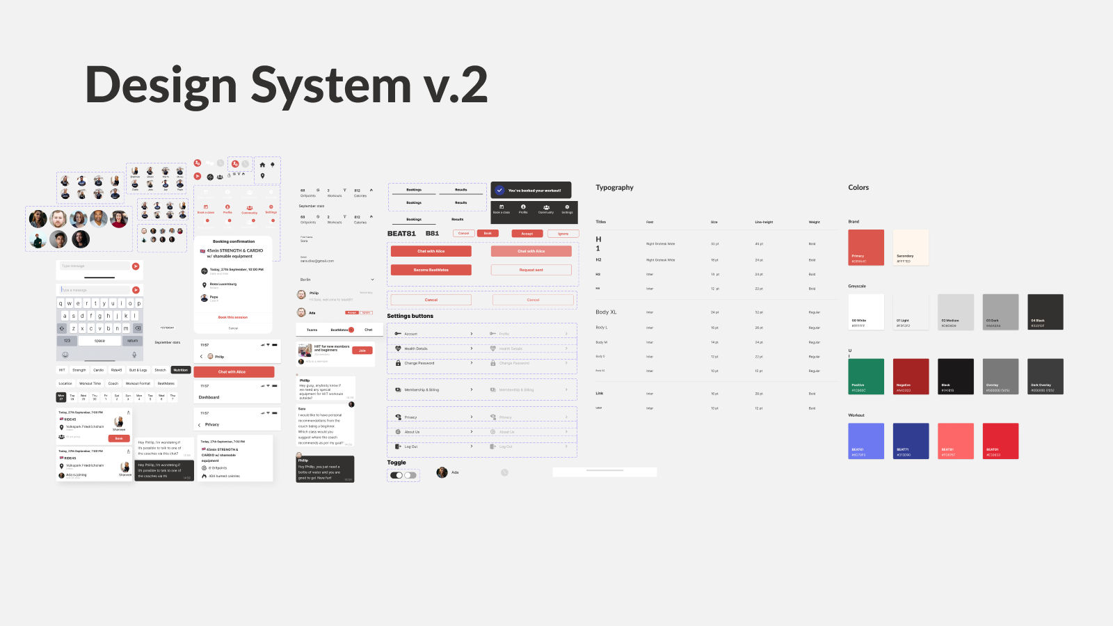
During this stage, we developed our UI elements based on the User Interface of their Acquisition website, following the Atomic design principles.
1
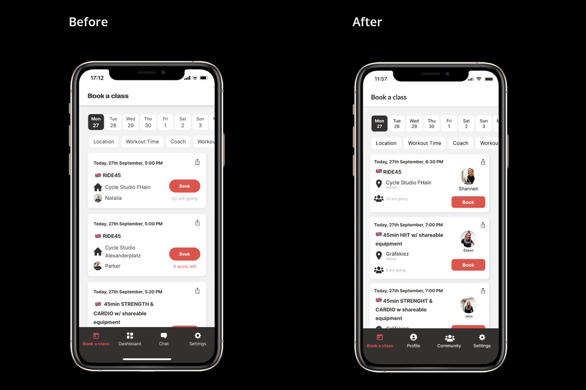
Increased feeling of belonging Based on the results of the first test, we reorganised the workout card’s content to increase the visibility of the participants, accentuating the feeling of belonging to a group.
2
Matching stylesThe CTA button was changed to fit the new style, which was already implemented on the website.
3
New filter optionWe also add a new filter option to search for the workouts that friends will attend, avoiding pointless scrolling through the many workouts that BEAT81 offers.
4
Increased icon recognitionWe also changed the location and address icon, making it more recognisable and easy to read.
5
Identifying the coachesWe too defined a larger size and position for the Coach image, because in many responses from our UX research we found that a motivational coach is also an incentive to attend workouts.
6
New NavbarWe decided to modify the Navbar, arranging the Chat into the Community menu. Also here, we added the already mentioned filter option to make it easier to find a group of interest. We too replace the Dashboard menu with the Profile menu.
Adapted after changes
The V2.0 result
The following video shows the three proposed user flows for the BEAT81 app's Community function, as if Sara were using it.
Adapted after changes
Testing V2.0
After uploading our Hi-Fi prototype to Maze for our final test, we received 22 replies, of which 17 were able to fulfil the task and 5 gave up. From here, our most relevant Insights were that:
1
The display of the list of participants on the workout result page needs to be improved.2
Users got confused that they had to click once more and go deeper to see workout results. We could reduce the amount of clicks in a future Iteration.
Continuing the Journey
Next steps
Next steps
As our project was built in the existing app, we would like to test it with real users to learn from their reactions. Our learnings were based on the results that we got from our research with also non-users of BEAT81, but we consider that more accurate research and testing is needed to deliver a tailored experience to the real users to give them exactly what they need.
Due to the time constraints, we left many ideas from the Should have section of the MoSCoW method for the next sprint. They have the potential to help to reach our KPI, and we believe that they are worth a try in a future round of testing. The results of these would show us if the users think that our assumptions were right.
Insights Gained
Learnings
Learnings
1
Roadmap relevanceI think that this project was very Insightful in many ways, such as showing us again that the importance of having a well-planned roadmap is key if at some point the project must go back to some stages or anything unexpected happens. As in our case, this allowed us to deliver a better product, we wouldn’t have had the opportunity if we hadn’t prepared and maintained our roadmap.
2
Keep researchingI also learned that even if a project has already some research done, it doesn’t hurt to validate these results with another research, if the roadmap and the time constraints allow it. Many deep learnings for our project came from our interviewees, and without them, it would be much more difficult to continue with the Ideation stage.
3
Ideate, test, repeatAnother learning was that there is no such thing as bad ideas or a specific order to implement features and solutions like a recipe on a project. Everything should be tested and analysed (according to the correspondent roadmap, of course) before emitting any judgement or taking any resolution.
Interested in creating value for your business or project?


