My role in this project
- UX research
- UX design
- Prototyping
- UI design
- Brand design
Problem
During the Covid-19 pandemic, many people suffered from Generalized anxiety disorder (GAD) without finding tailored help for their needs, due to the variety of triggers why symptoms can happen.
During the Covid-19 pandemic, many people suffered from Generalized anxiety disorder (GAD) without finding tailored help for their needs, due to the variety of triggers why symptoms can happen.
Outcomes
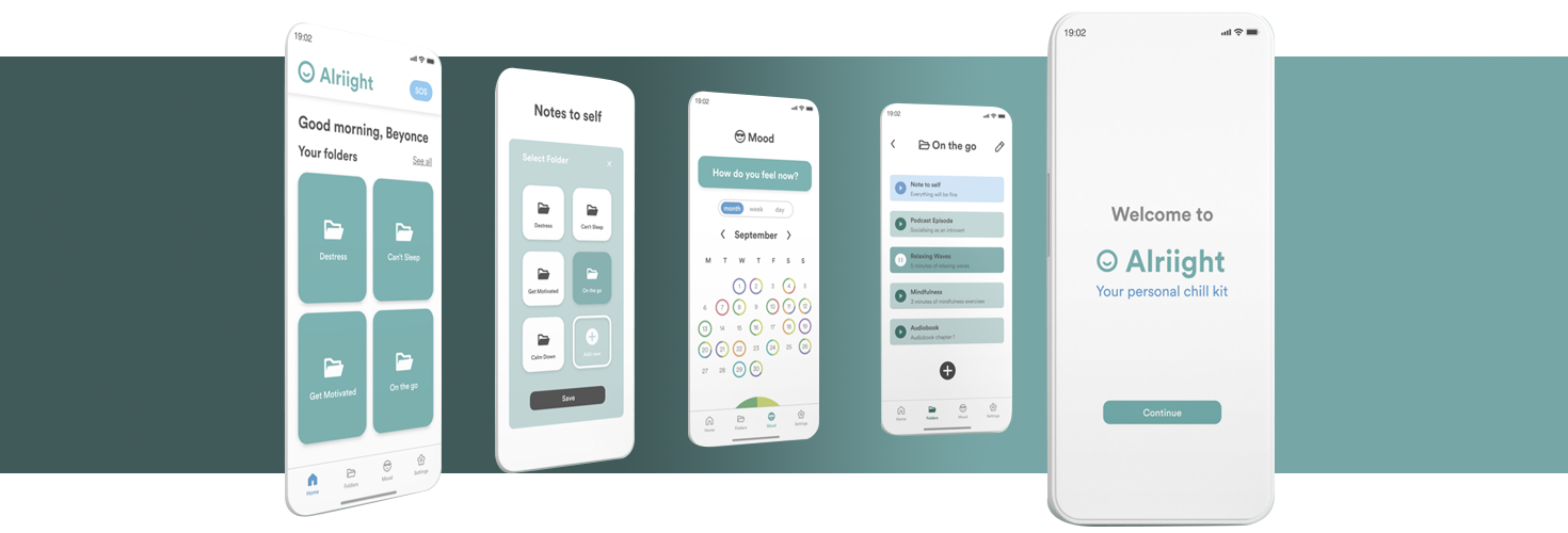
- A toolkit app where users can keep the most useful tools to help them cope with GAD symptoms discreetly when in public spaces.
- A tool that allows users to acquire independence and improve their life quality.
Client
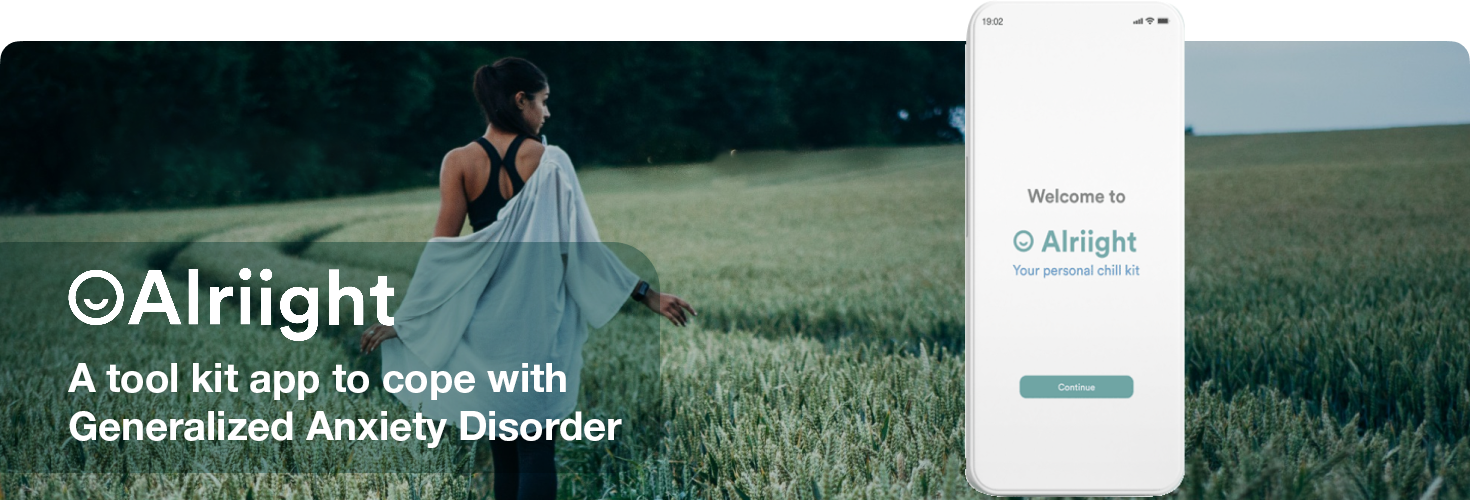
Alriight app
This project was developed during my professional training for the UX/UI Ironhack Bootcamp. The goal was to create a product based on findings made during the User Research to support the wellness industry.
Alriight app
This project was developed during my professional training for the UX/UI Ironhack Bootcamp. The goal was to create a product based on findings made during the User Research to support the wellness industry.
Additional Information
Team
Aline de Oliveira Barros, Iona Keeley, and myself.
Platform
iOS / Android
Timeline
9 days.
Team
Aline de Oliveira Barros, Iona Keeley, and myself.
Platform
iOS / Android
Timeline
9 days.
Unlocking User Insights
User Research
To get a better understanding of what millions of people around the world experience on a daily basis, we decided to conduct a series of interviews with people affected by this syndrome. These are our key findings:
1
Coping StrategiesEvery person suffers this condition in a very different and personal way, thus everyone has different coping strategies that work for them, but may not work for others to the same extent.
2
PrivacyThey have enough on their plate without having to worry about being scrutinized by others while trying to deal with an Anxiety attack in a public place. They need to solve it privately, even if they are in public.
We also had an interview with a therapist to get a professional perspective on the subject and these are our key findings.
1
SupportIndividuals with anxiety disorder and depression often require substantial support from their community and close connections, despite facing challenges in expressing these needs.
2
StabilityTrust and consistency are crucial in various activities, such as communication or exercise, for individuals with Anxiety disorder.
3
AwarenessApps and tools can be beneficial in the initial stage to help individuals comprehend and acknowledge symptoms or disorders when understanding may be limited or resisted.
4
UpliftmentEngaging in rewarding activities has the potential to elevate mood
5
GuidanceApps should guide individuals with anxiety disorder toward seeking professional help, whether through medication or therapy.
6
AccessibilityApps can simplify the challenging process of finding therapists, particularly in locations like Berlin, by offering contact information.
7
ModerationA community for individuals with anxiety disorder to share thoughts is beneficial, but professional moderation is crucial to prevent overwhelming statements.
8
ChatbotsIn the absence of suitable supervisors, chatbots can be valuable in educating individuals with anxiety disorder.
In addition, we conducted online surveys with adults of different genders for quantitative research, which provided us with the following findings.
40%
of our respondents suffer Anxiety attacks.40%
were unsure if they might have suffered one in the past.5
most common symptoms:feeling restless; feeling worried; struggling to sleep; heart palpitations; panic attacks
80%
consider audio content to be important.70%
consider important to have breathing or mindfulness contentA≠B
To cope with these symptoms, each person has their own method.
Nice to meet you
User Persona
Based on the knowledge gathered from the research, we define a User Persona, called Anna Blaser, a 25 years old Bachelor student in Communication, who lives in Berlin and suffers from Anxiety attacks when in public spaces.

What else is out there?
Competitor analysis
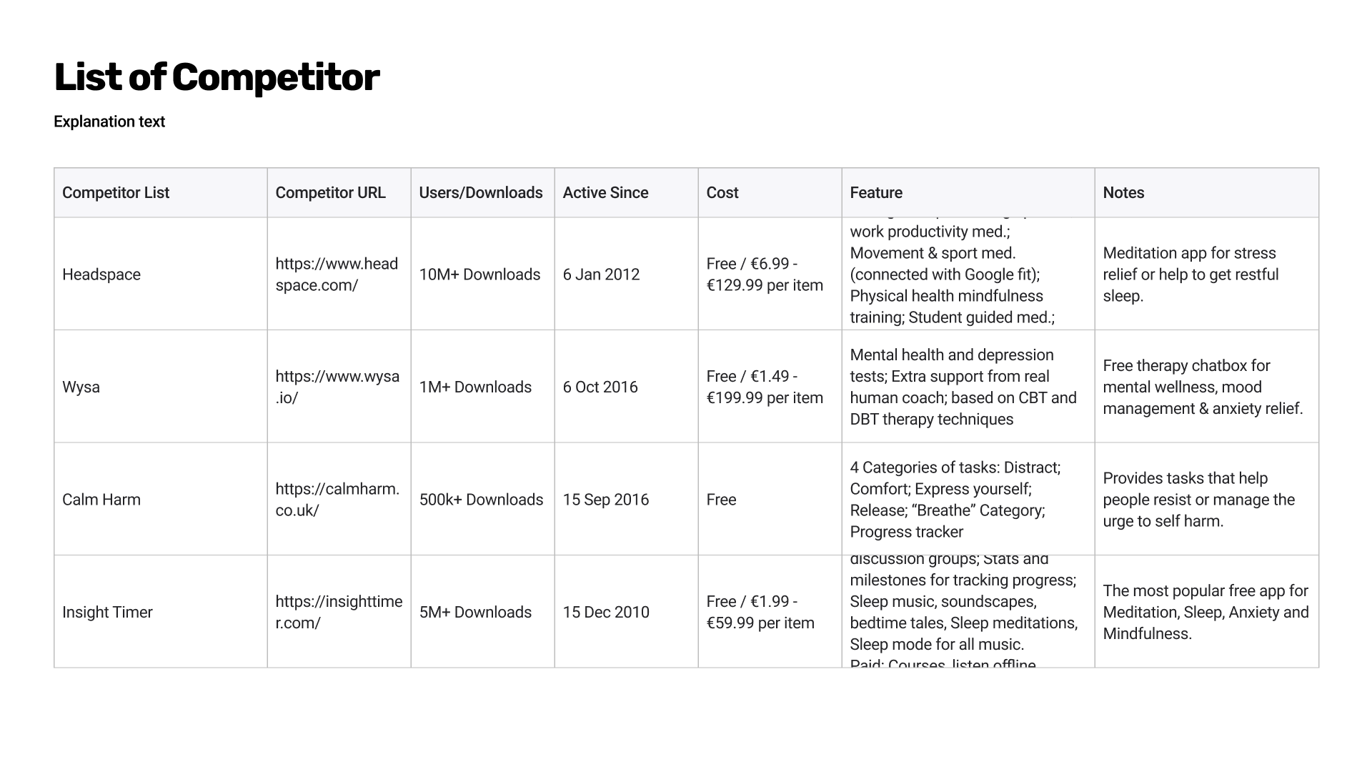
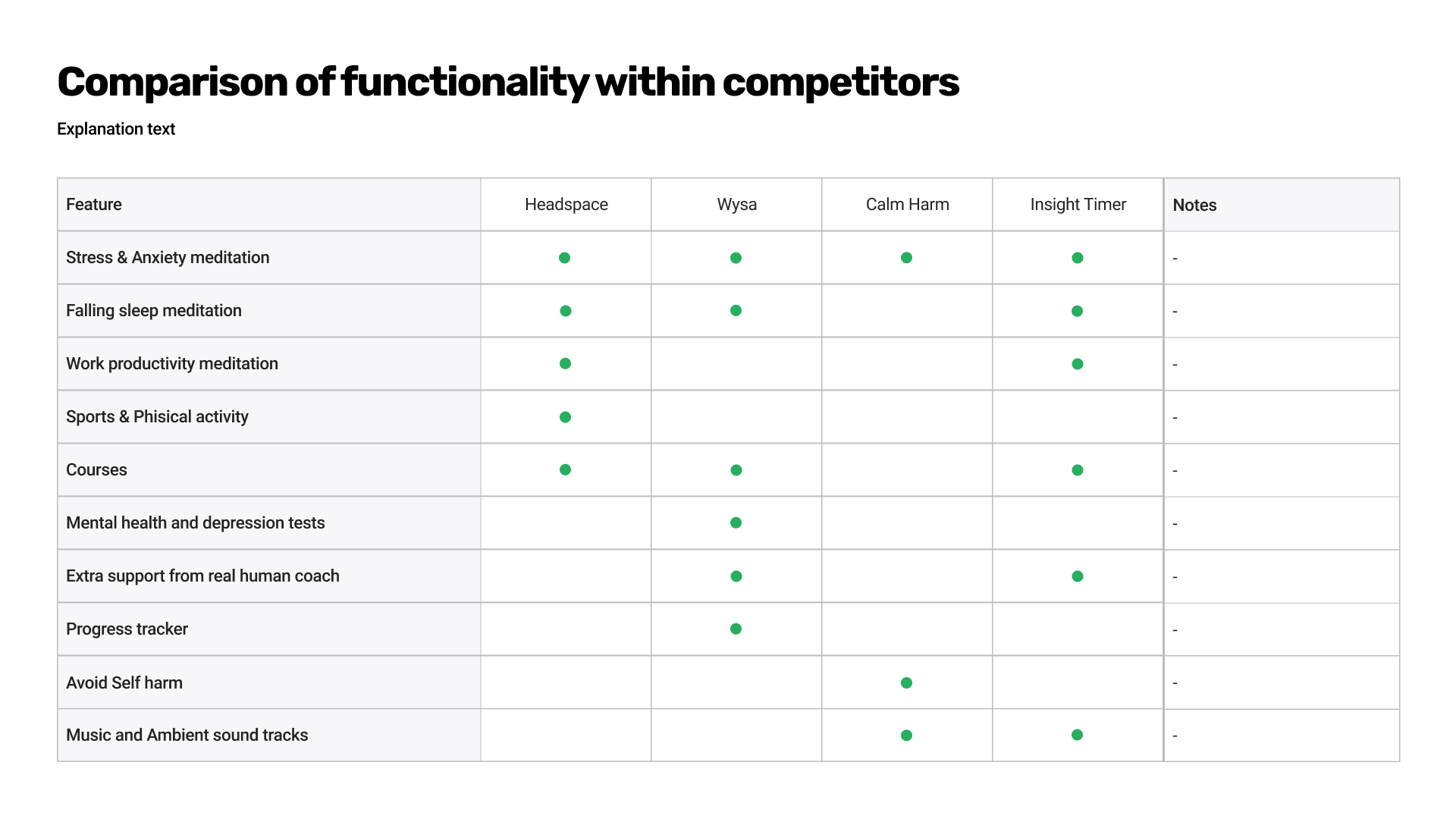
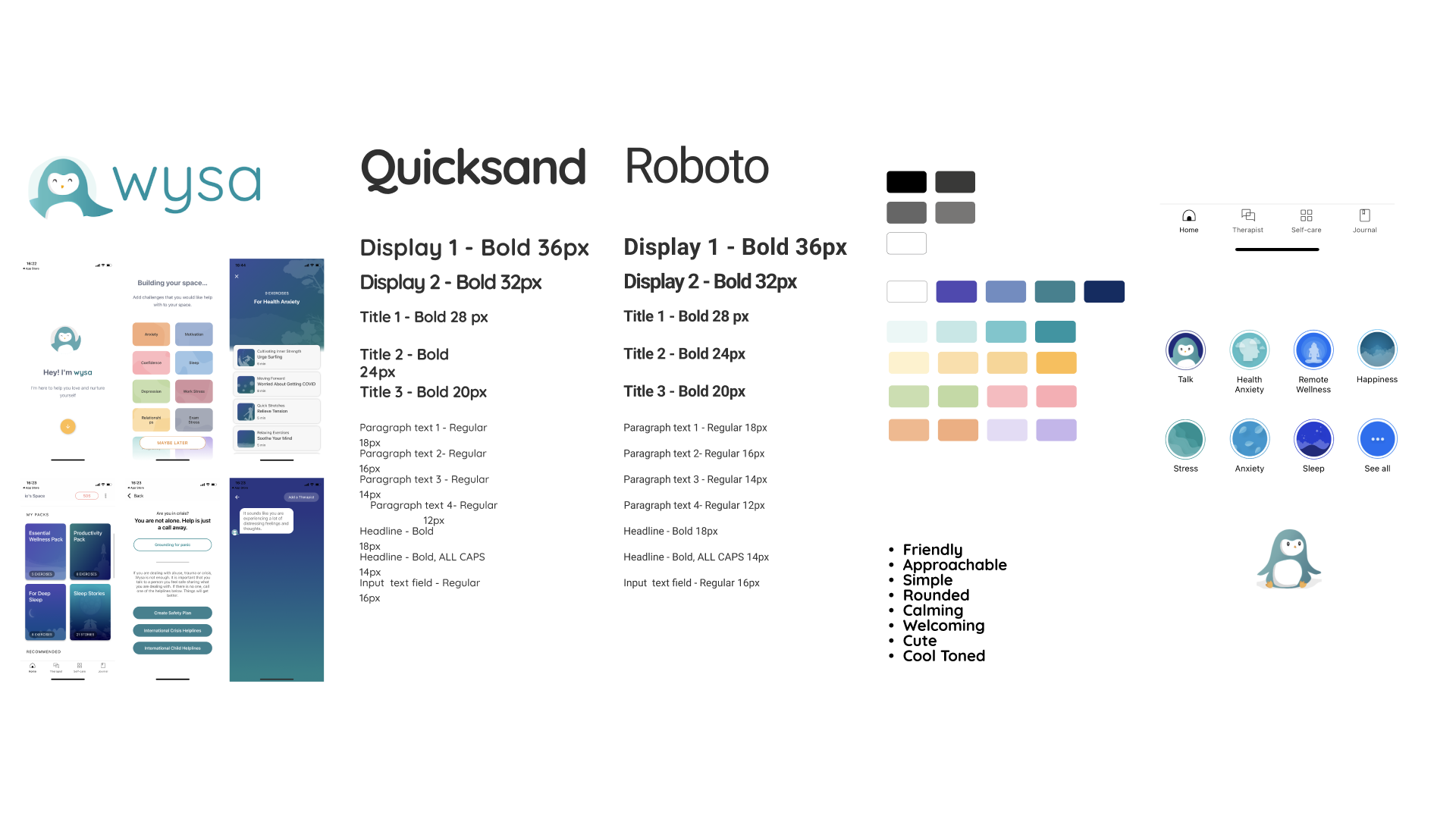
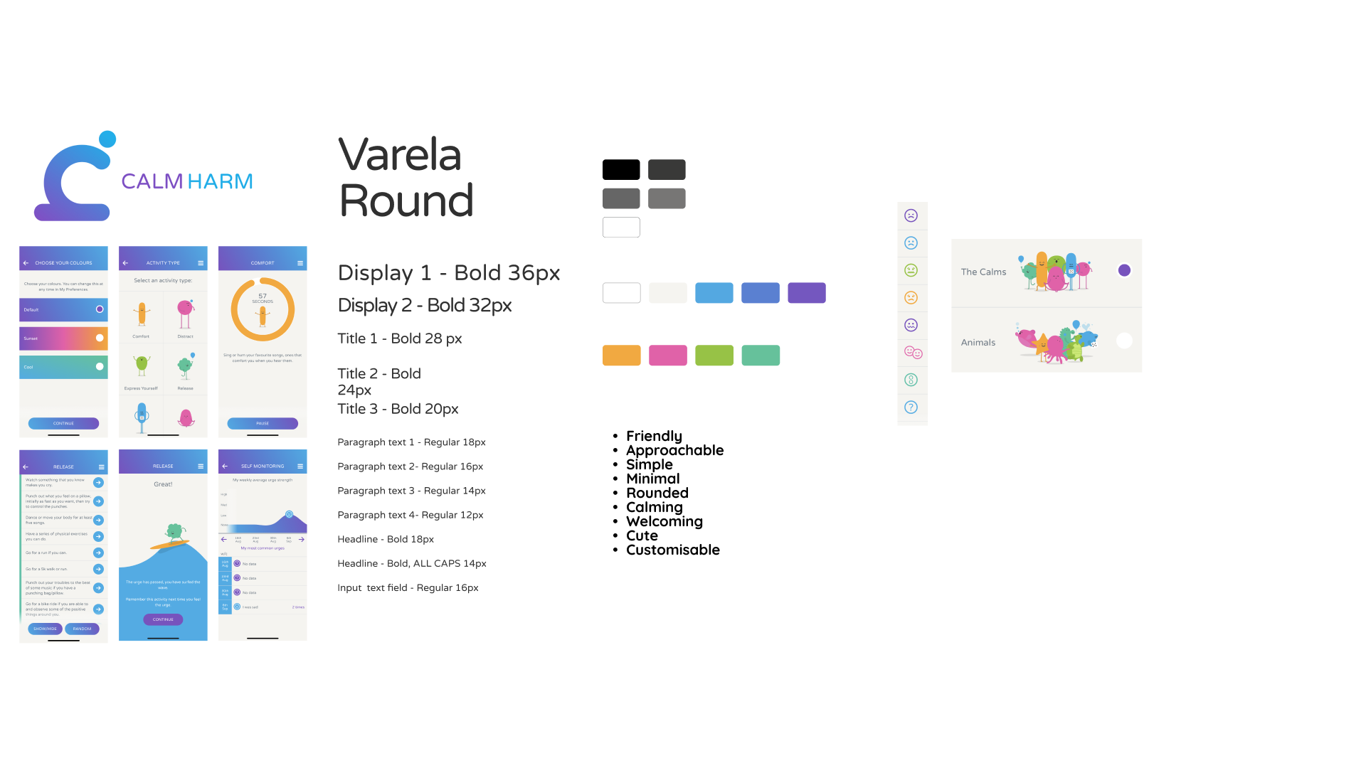
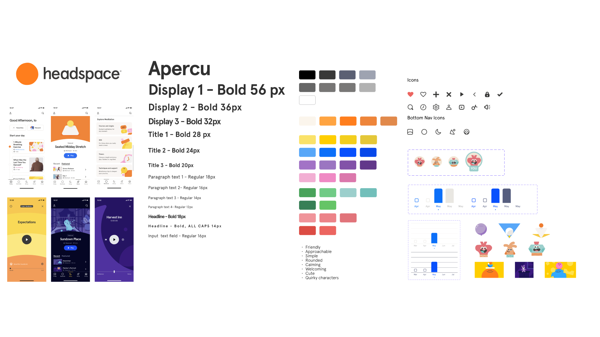
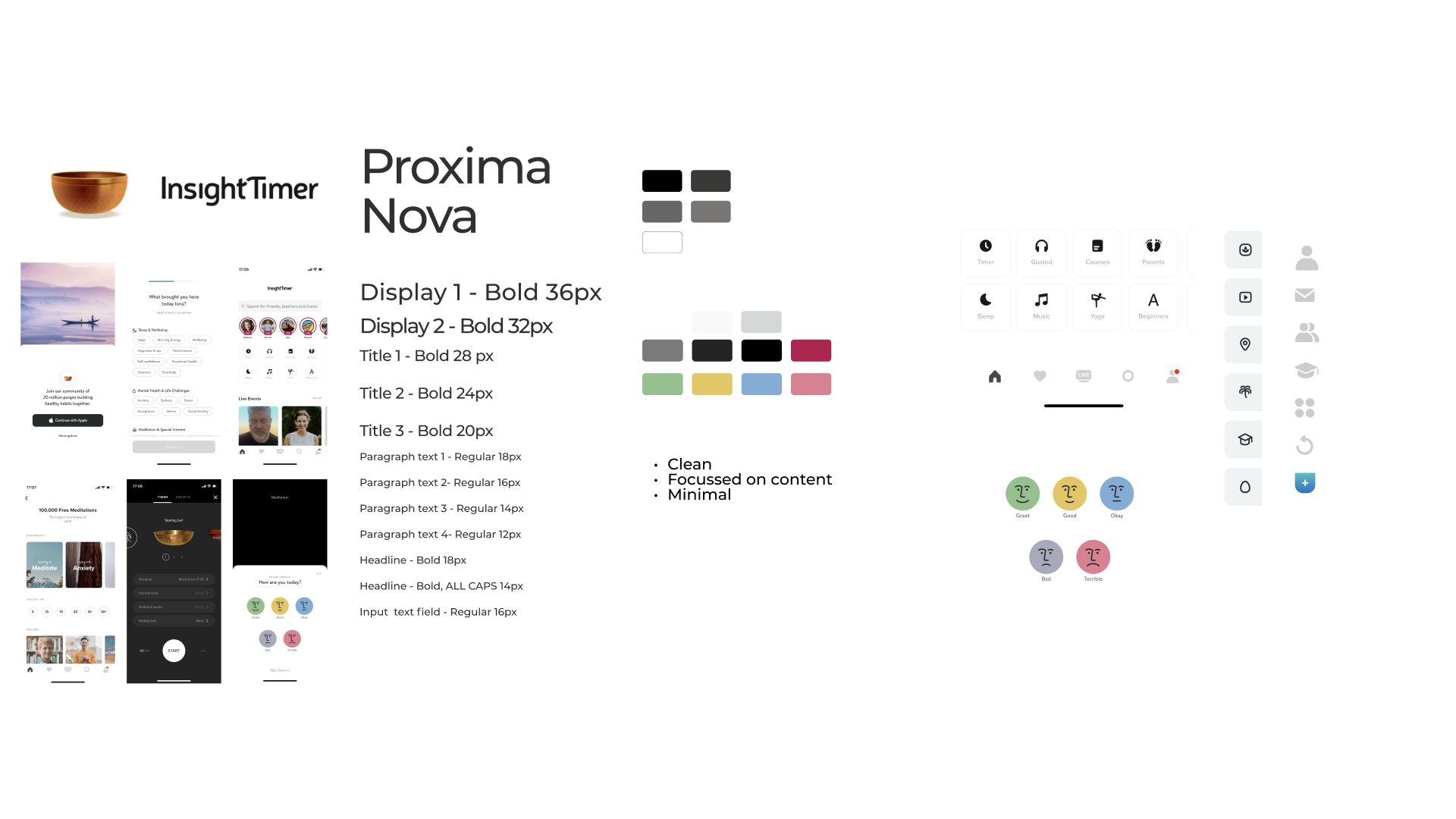
We then selected the four most named apps available on the market to carry out a Competitor and Visual Competitive Analysis. We did this, so we could better understand not just the market but also our user needs by comparing similar strategies and elements.

1
Different focusMost of these apps have their focus on relaxation and meditation, which it’s nice, but they don’t fulfil our users needs when suffering an Anxiety attack.
2
BugsThey also have repetitive errors after updates, which interrupt the normal user flow and can become the oppposite of what they were created for.
3
AI IntegrationSometimes, when chats are automatised with AI they ended up feeling not human for the users, which produce a negative effect when what they need is to calm down.
We learn very interesting insights from our Visual Competitive Analysis as shown in the following images.
1
Limited customizationNot every app allows to personalised content tailored to the individual user’s needs.
2
Soothing colors and imagesMost apps feature dominant navy blue, purple-blue, and green hues, often as gradients, contrasted with warm colors, primarily in the orange range. The illustrations or photographs are subdued and calming.
3
AI IntegrationThe four apps use Sans-Serif rounded fonts, to appear modern and with a more informal look.
Why do we do this?
Problem definition
Individuals experience GAD uniquely, each employing personal coping strategies that vary in effectiveness. For those with GAD, managing anxiety attacks in public is an added challenge. Privacy becomes paramount during these moments, allowing individuals to address their condition without the added stress of external scrutiny.
Hypothesis
We believe that by creating an app with easy and discreet access to anxiety-reducing tools, we can help people sufering from GAD manage their anxiety in public spaces.
We’ll know this is true when we hear positive responses through qualitative interviews, when users recommend the app to friends, and when the app receives high ratings.
Getting creative
Ideation
We initiated this phase by combining Round Robin and Crazy 8’s methodologies to stimulate our creativity. As we gathered numerous ideas, we employed the M.O.S.C.O.W. matrix to assess and prioritize solutions that best aligned with our How-Might-We statement.
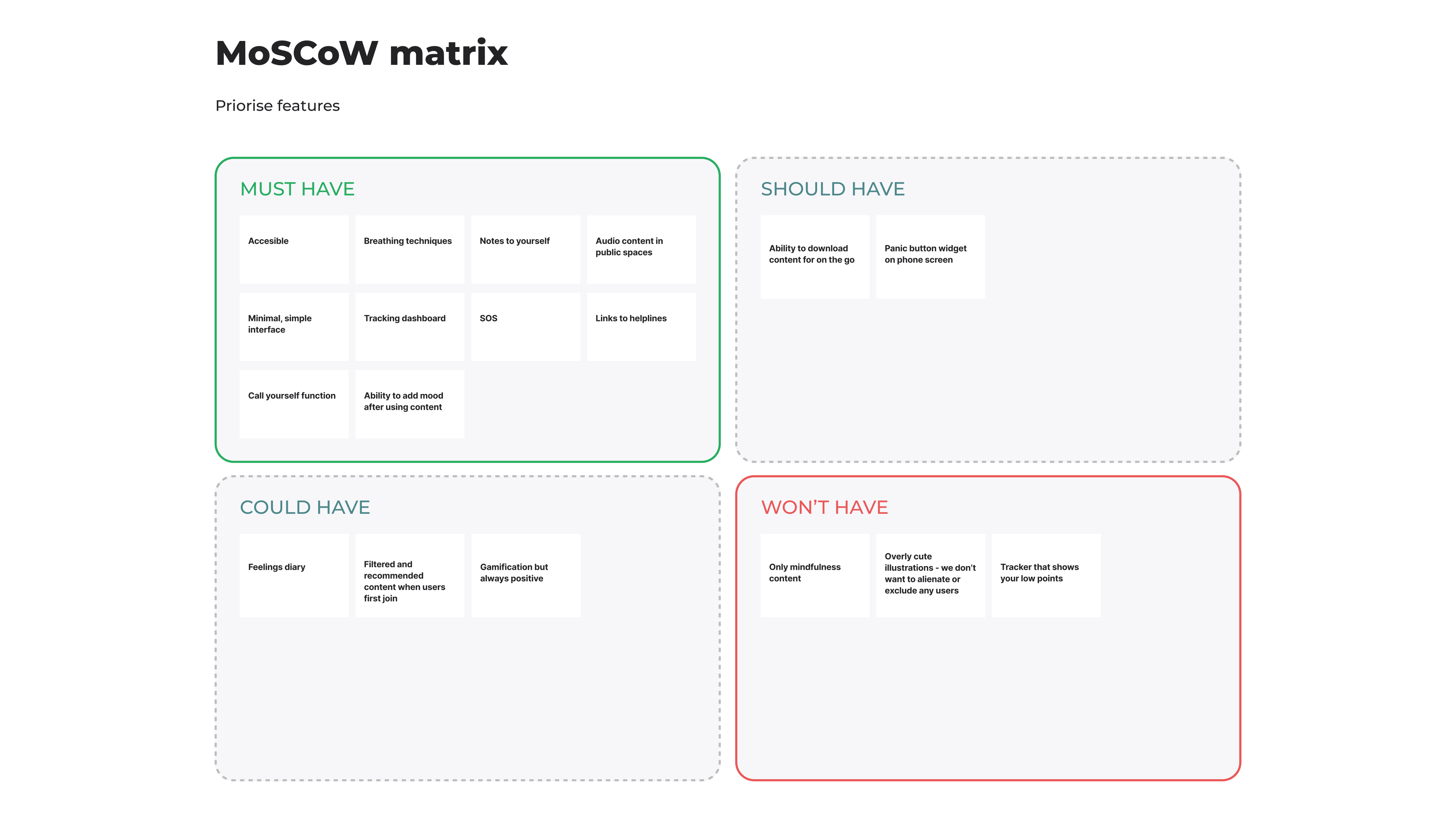
We decided to include the Links to helplines and Call yourself function from the “Should have” into the “Must have” section due to their ease of implementation and potential significant positive impact on users during anxiety attacks.
Additionally, we opted to integrate the Ability to add mood after using content feature. This allows users to maintain a clear record of the effectiveness of features, aiding data visualization of their progress and providing valuable insights for discussions with mental health specialists.
Moreover, we consistently bear in mind that the tracker won't label users' challenging days as 'low points.' We take special care in presenting the data about users' states of mind, ensuring it doesn't discourage them when reviewing their logs.
How should it work
User flow
Following,
we define two different User Flows for our users when in contact with our app, based on two different mental states of Anna.

1
New UserThe first happens when her mind is clear and she downloads the app, thanks to a recommendation from a friend, and she has some time to set it.
2
User exeriencing anxietyThe second flow happens when having an Anxiety attack in a public space, so she needs to access quickly and easy her tailored content to help her ease her symptoms.
3
Main focusWe decided that our main focus would be on the second flow, as this is the time when the app will be most needed.
UI design
Prototyping
In the subsequent phase, our team crafted LO-FI prototypes, aligning with insights from prior stages to address the How-Might-We statement effectively. Diverse ideas and techniques were considered, generating a comprehensive pool. Subsequent voting refined the selection, prioritizing concepts with the potential for optimal outcomes.
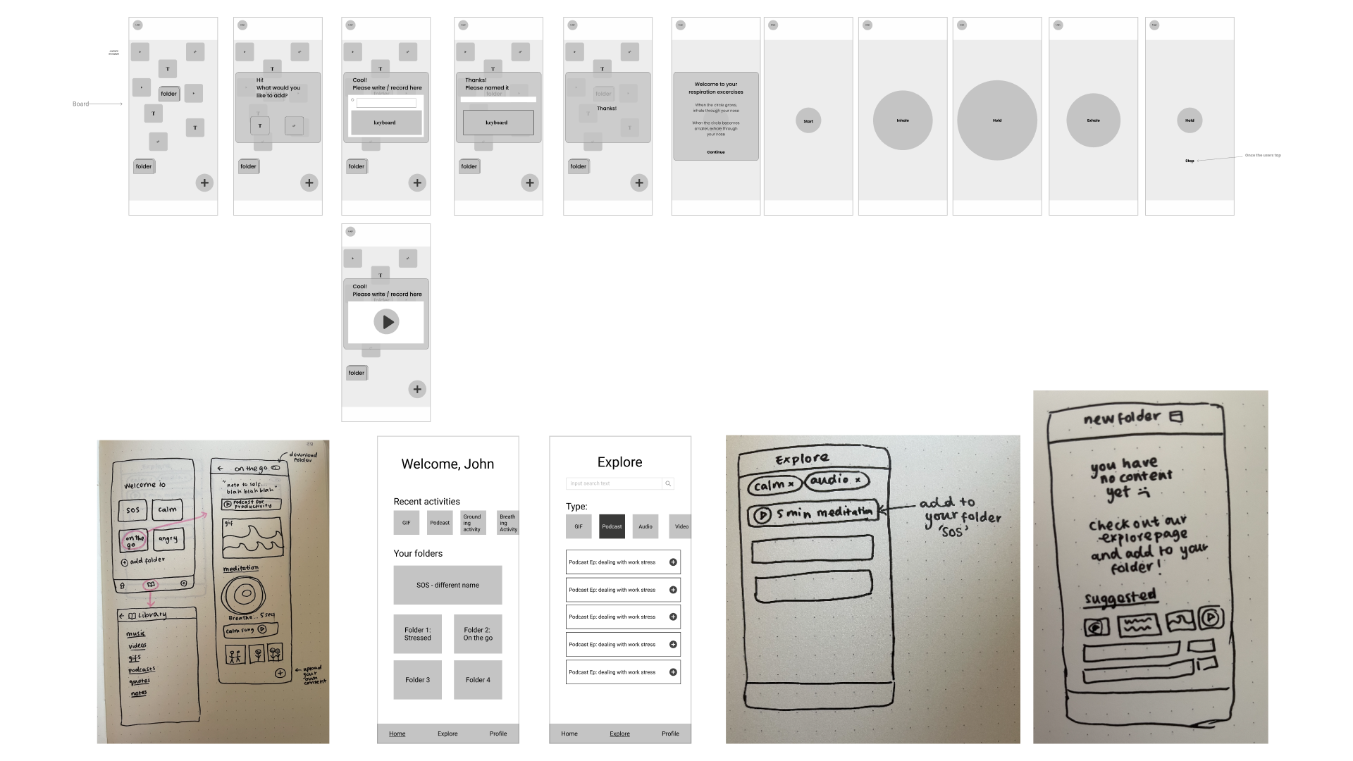
As we initiated the development of MID-FI prototypes, shaping the initial structure of our app, we concurrently established a Design System. Recognizing the likelihood of adjustments, early definition aimed to streamline future development stages.
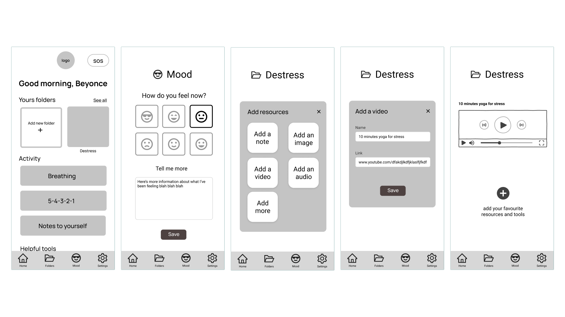
We then proceed to test the two user flows previously defined on maze.co.
A total of 22 people tried to complete the tasks that we wanted to evaluate, and from their interactions we learn the following:
>94%
First user flowAlmost every tester could complete the flow via the expected path, with a 5,9% give-up/bounce rate.
100%
Second user flowAll testers could complete the expected path on the most important flow.
Insight 01
More intuitive
We receive some comments from were we learn that it wasn’t intuitive enought to click on the mood icon to display an input field to explain the reason for the corresponding entry.
Insight 02
OnboardingOnboarding would be needed to learn how to use the app, to reduce the uncertainty that it might cause during the discovery phase for the user, so as not to add any stress reason.
Insight 03
LabelingWe learn as well, that it wasn’t obvious for the testers to click the folder’s name to be able to edit it and change its name.
How will it look
Mood board & Design system
Based on what was learned in the previous stages, we define that
our mood board should have light pastel colours, calming images and maybe illustrations to help the users to chill while navigating the app. It should also use modern rounded Sans-serif fonts, to keep a fresh and easy to read look, while at the same time reinforcing the calming UI.
That’s why we choose Circular Std Bold as the main Typeface for this app. For the logo, we designed a simple wordmark with the app’s name using the same Typeface as in the app, accompanied by a simple and abstract smiley face.


Testing with stakeholders
Hi-Fi Prototype
We finally implemented all the findings and insights learned during this sprint in the latest versions of our prototypes, which you can see now in the following videos.
1
Set profileHere is shown Anna’s first User Flow. When she opens the app, she is welcomed by a short animation, followed by the settings needed for the app to work, like the user’s name, country, and language.
2
First screenAfter that, she reaches the home page, where the first that she explores are the different exercises in the activities section.
3
Content settingsThen, she visits the folder section, where she needs to name her first folder in order to add content to it, what she does by adding a video from YouTube. From there she goes to register her mood for the first time, adding a text note to the activity log.
4
Ready to goAfter doing this, she now knows how to tailor her folders, where to find exercises to relax, and how to register her mood and add a note to it.
In the second user flow some time has passed since Anna installed the app on her smartphone, and now that she’s going on the U-Bahn to another work activity, she needs to use Alriight to calm down before starting an Anxiety attack in front of strangers.
1
Calming downTo do so, she accesses her folder “On the go”, which she already has prepared for a situation like this. There Anna decides to listen to an audio file with relaxing waves sounds.
2
Tracking her moodIt takes a bit of time until she calms down, but after all, she is now fine and decides to register this situation on the mood tracker. There she already has added something before, but now she is feeling better than before.
3
Improvement overviewAfter that, she checks her progress during the week and the month, recognizing her improvement during this time.
4
SOS buttonJust in case, she checks one last time the SOS section, where her most trusted friends were listed by her to be contacted in case of emergency, and where she can also find the feature to call herself, simulating that she received a phone call, allowing her to escape a stressful situation without giving to many explanations.
Continuing the Journey
Next steps
Next steps
1
Test real usersAs the next steps of this project, we defined that the prototype needs to be tested again, this time only by people suffering from GAD to understand better the user experience about dealing with their specific triggers and solutions.
2
Self-awareness articlesAlso, we wanted to investigate the chance of implementing a fixed section with articles for Self-Awareness to help recognize Anxiety symptoms, as well as cat gifs and a recommendations section, to help Anna feel less stressed.
3
Test the navigation4
Automatic symptom recognitionMoreover, we wanted to explore the possibility of automatise the support, based on the activities of the user on the app, recognizing when Anna is feeling bad, and organizing tailored content to be shown.
Insights Gained
Learnings
Learnings
We discussed and talked long every decision since the beginning, because everyone was giving their best to succeed in helping others. So every decision was made very consciously, keeping in mind how the recent pandemic has affected so much the psychological health of many people in so different ways.
1
Empathizing is the keyIt was clear from the beginning that the product that we needed to design was going to be very sensitive, considering our users and their needs. And because of that, we choose to define two flows for the same User Persona because both flows develop in different circumstances, where the same person is in different mental states, and where the way it is used during an anxiety attack depends on the implementation made during the first flow.
2
Importance of a road mapOn the other hand, we also learned the importance of developing a flexible and well though roadmap, essential to define how much time should we use in the different stages of development of the project. It also helps to separate tasks, so everyone knows what task to focus on. Thanks to it we developed a great sensitive product, which seeks to help people to reach a better life quality.
Next Case Study:
How I drove the conversion rate by 15%. →
With an all-around browser webapp for the e-mobility industry
How I drove the conversion rate by 15%. →
With an all-around browser webapp for the e-mobility industry
Interested in creating value for your business or project?

